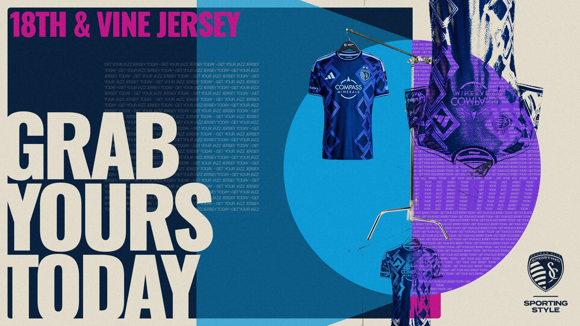
18th & Vine Season Campaign
Art Direction + Senior Designer
2026
The Making of
Concept Collaboration with Two Circles
Photographers Cassie Florido & Lauren Stefl
Set Design by Waked Creation
Building Connection and Collaboration
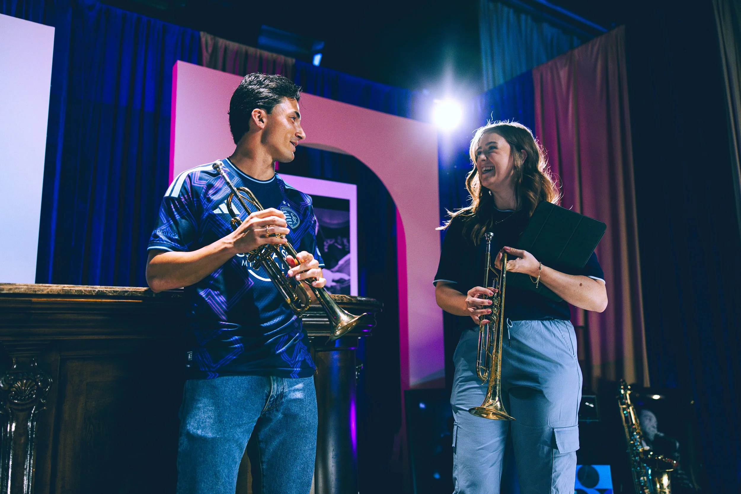
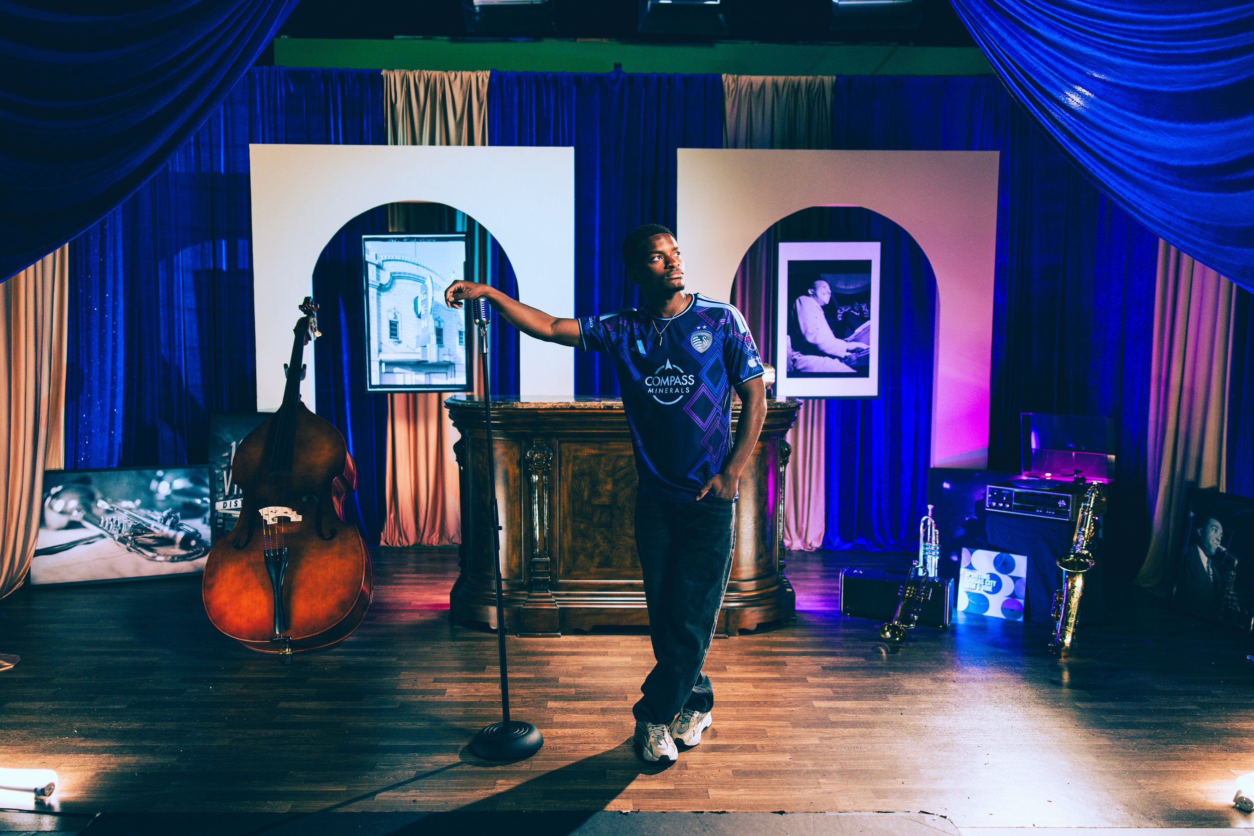
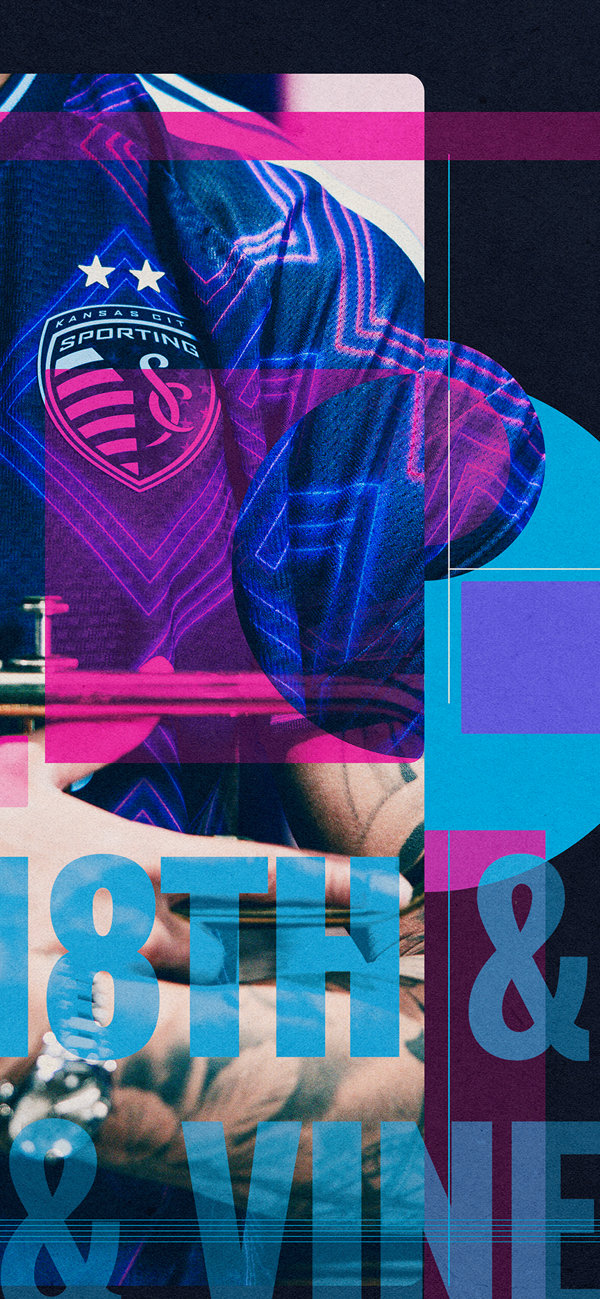
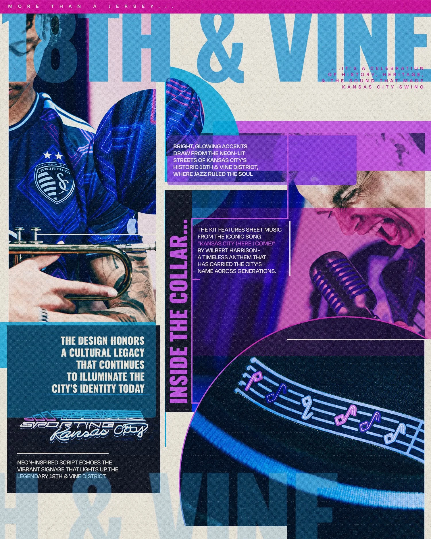
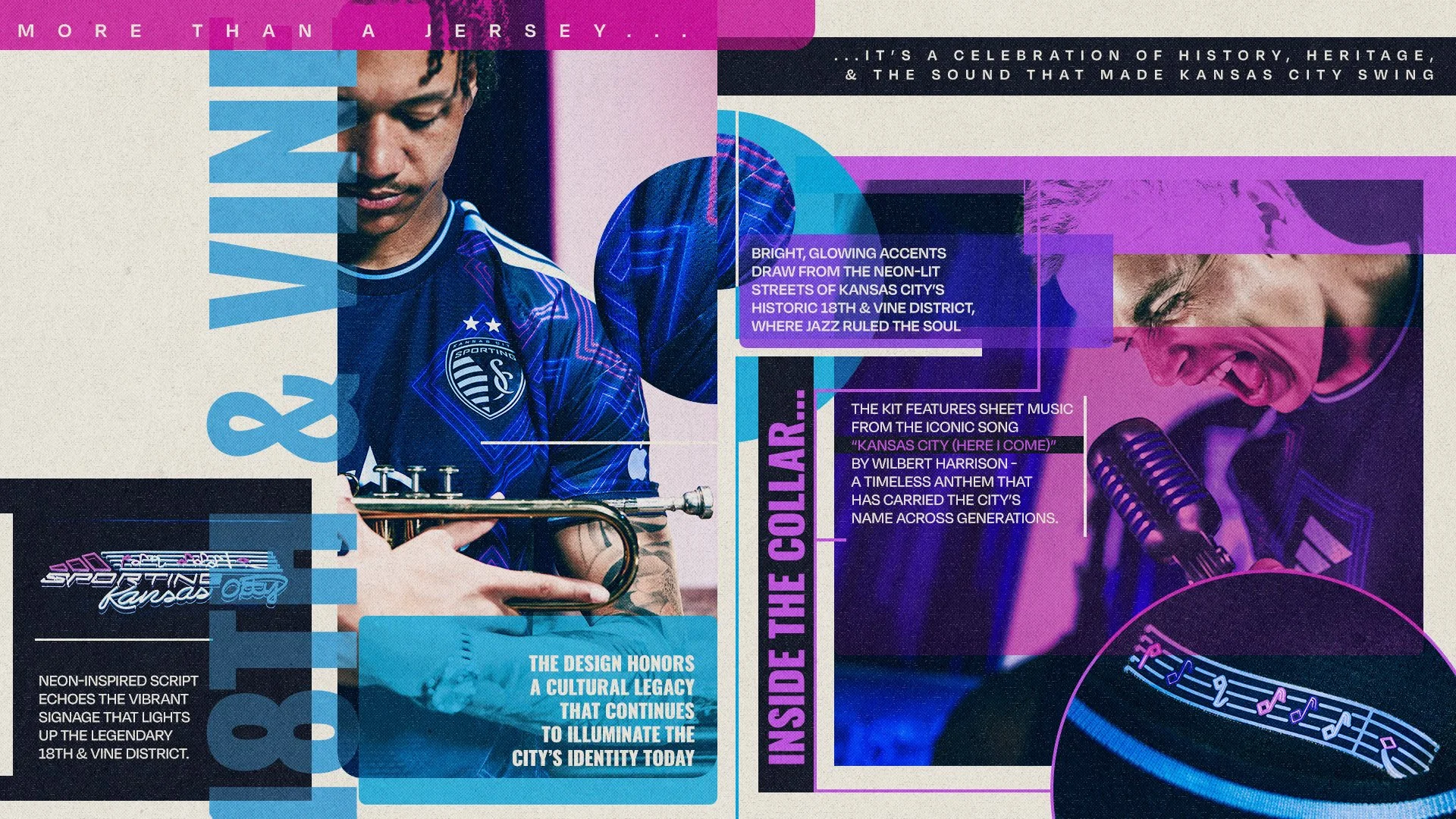
The 18th & Vine campaign was built around one central idea: creating a story around a jersey whose visual identity genuinely reflects the cultural influence of Kansas City Jazz while still feeling modern, cinematic, and unmistakably Sporting KC. The goal was never simply to release a jersey - it was to create an atmosphere and emotional connection that felt authentic to the city it represented. Once the visual storyline direction was established, the project moved into the creative shoot phase in collaboration with Two Circles and Waked Creation. The concept and photography direction were led by Two Circles, but the process was deeply collaborative from the beginning. In the weeks and months leading up to the shoot, we worked closely together refining the tone, mood, lighting direction, set inspiration, and overall emotional feel of the campaign.
A major focus during pre-production was ensuring the visuals felt cinematic without losing authenticity. We talked extensively about how the environment should feel, how props could contribute to the story, and how lighting could reinforce the atmosphere of late-night jazz clubs and historic Kansas City spaces. Waked Creation handled the physical set design and transformed those ideas into something tangible on set.
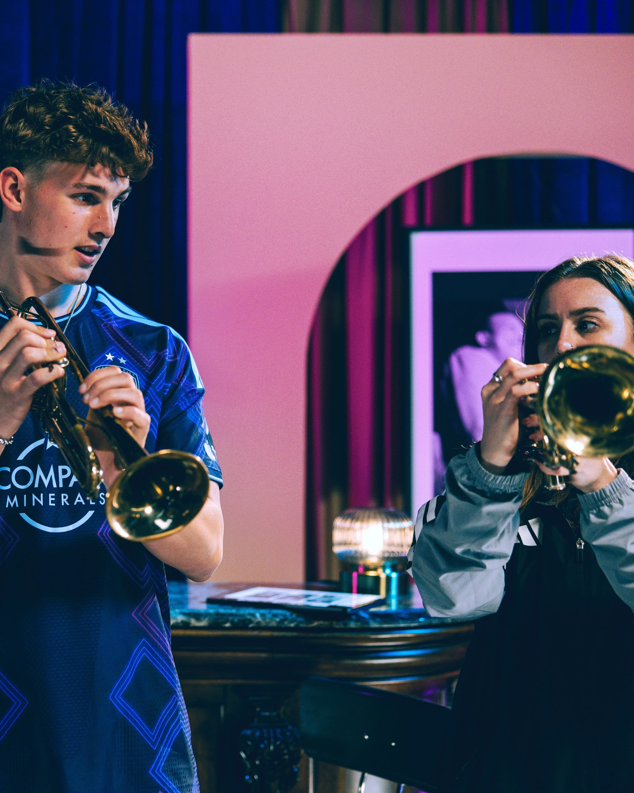
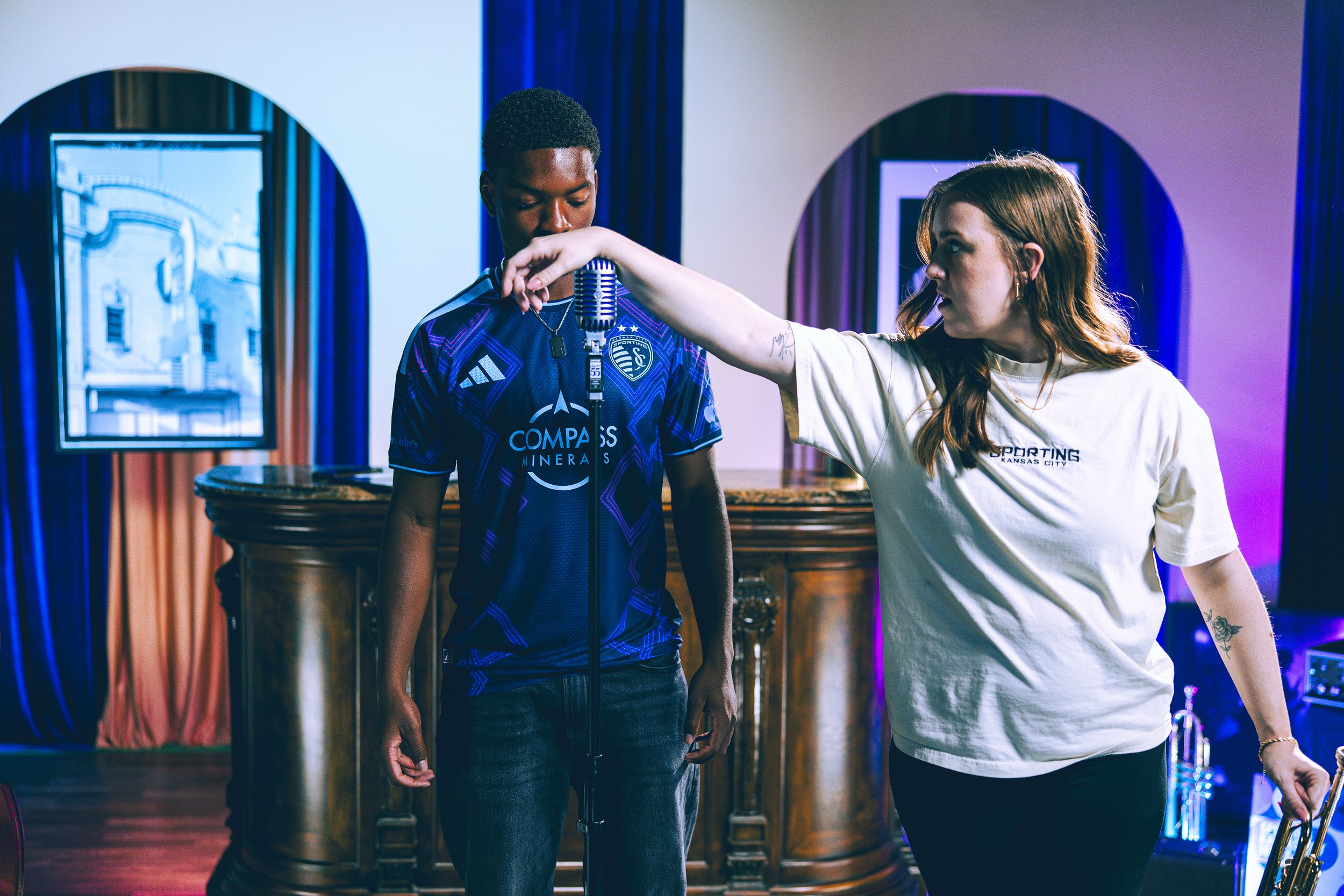
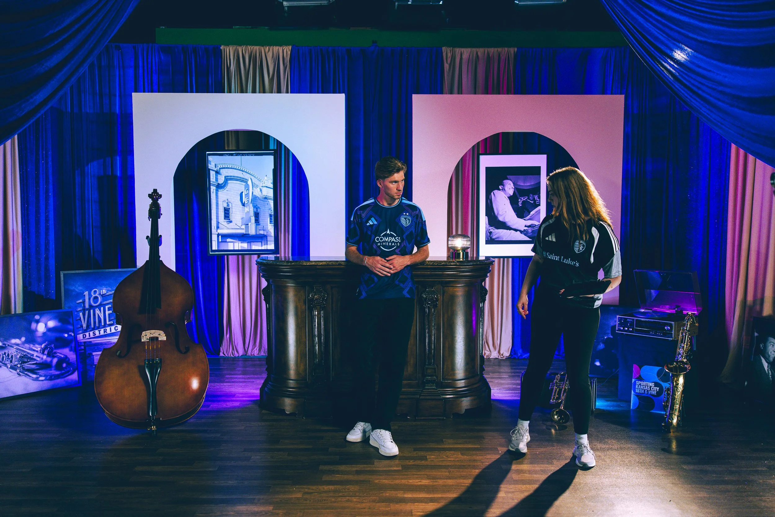
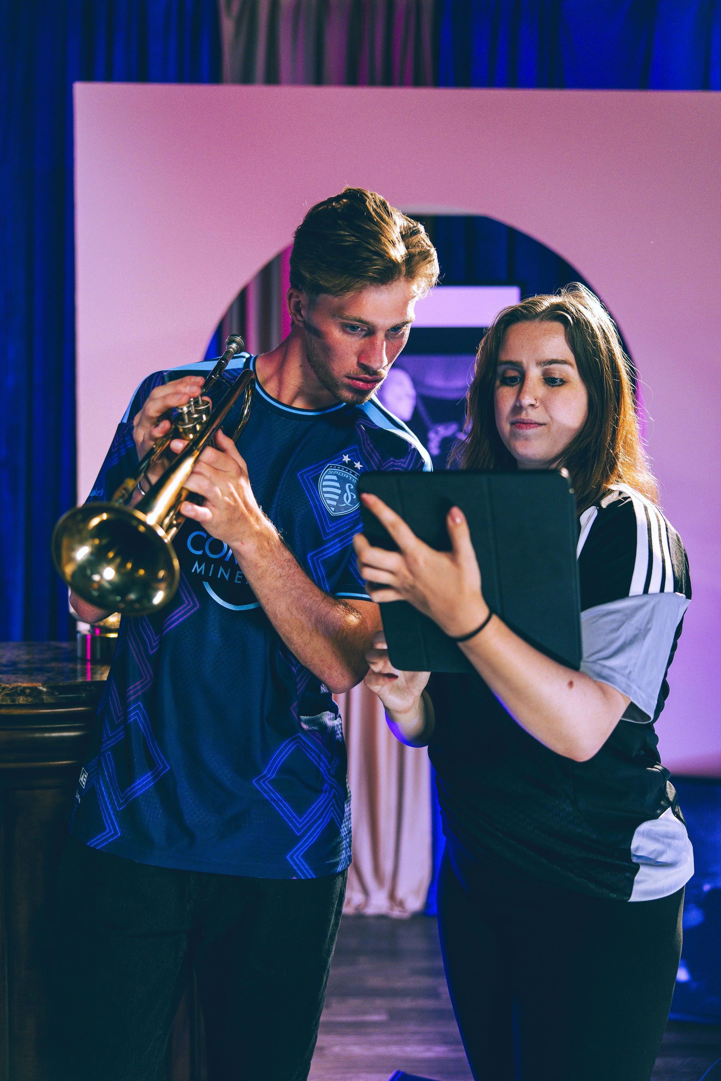
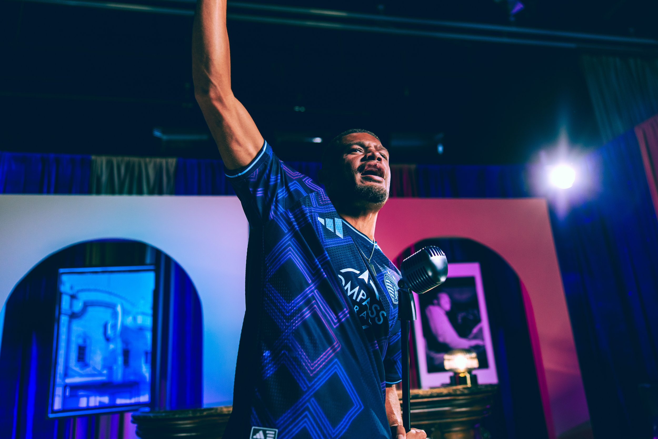
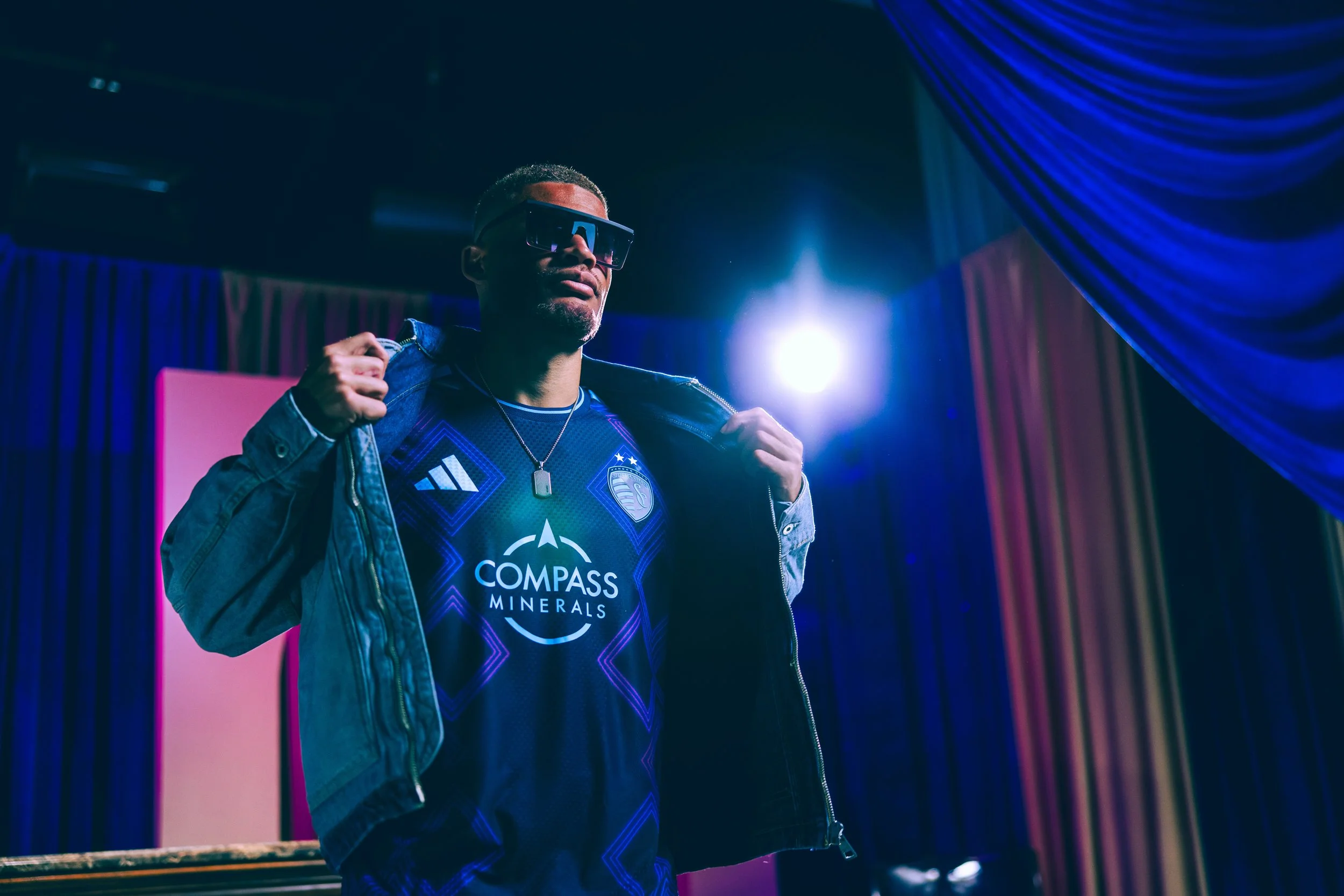
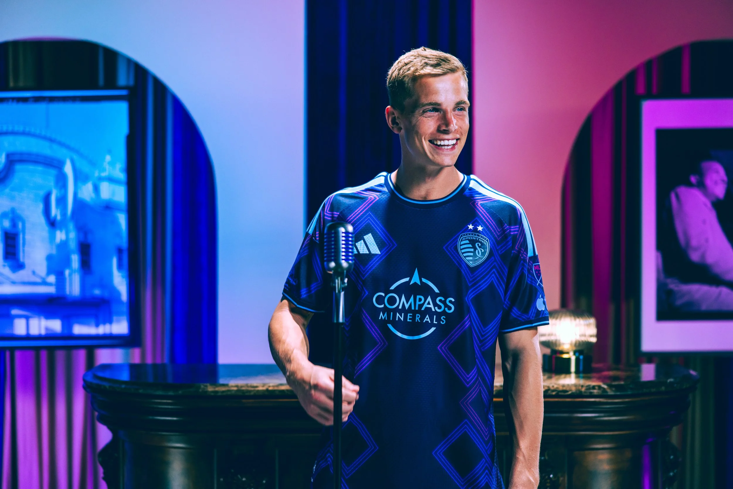
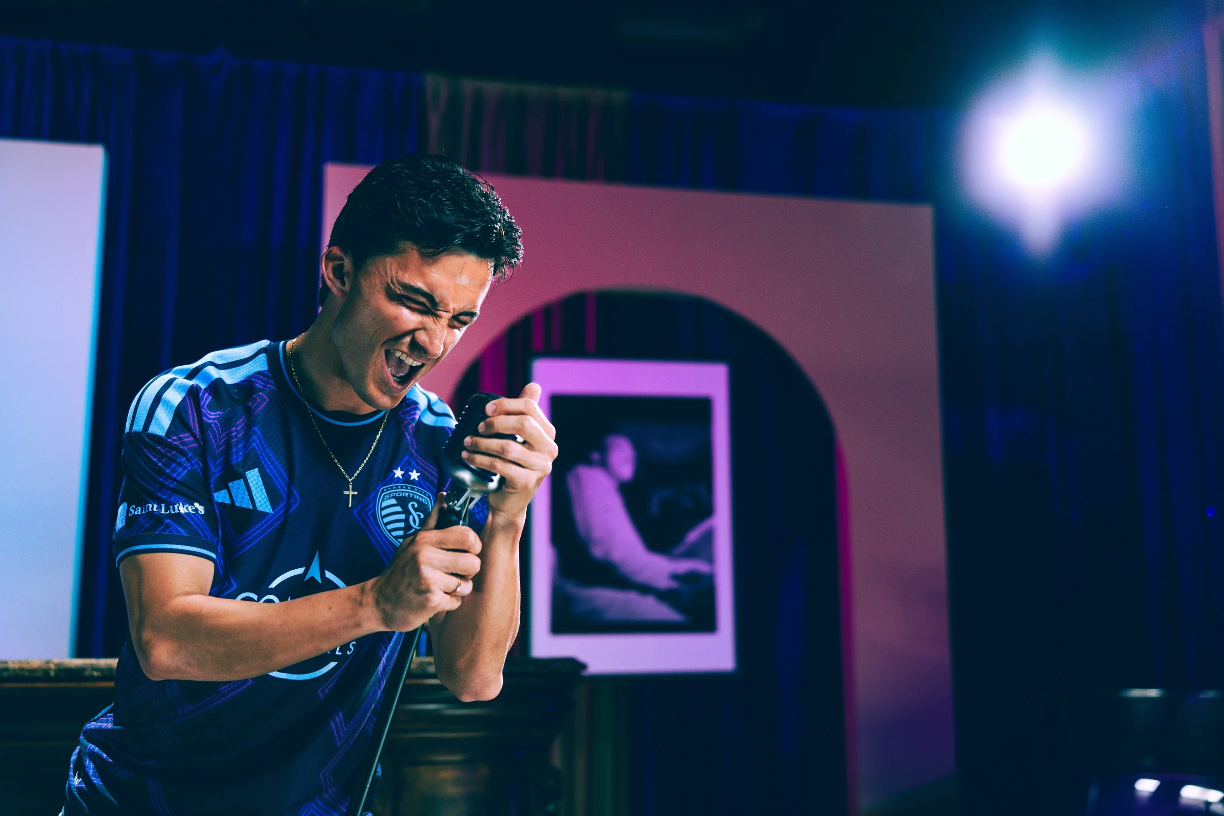
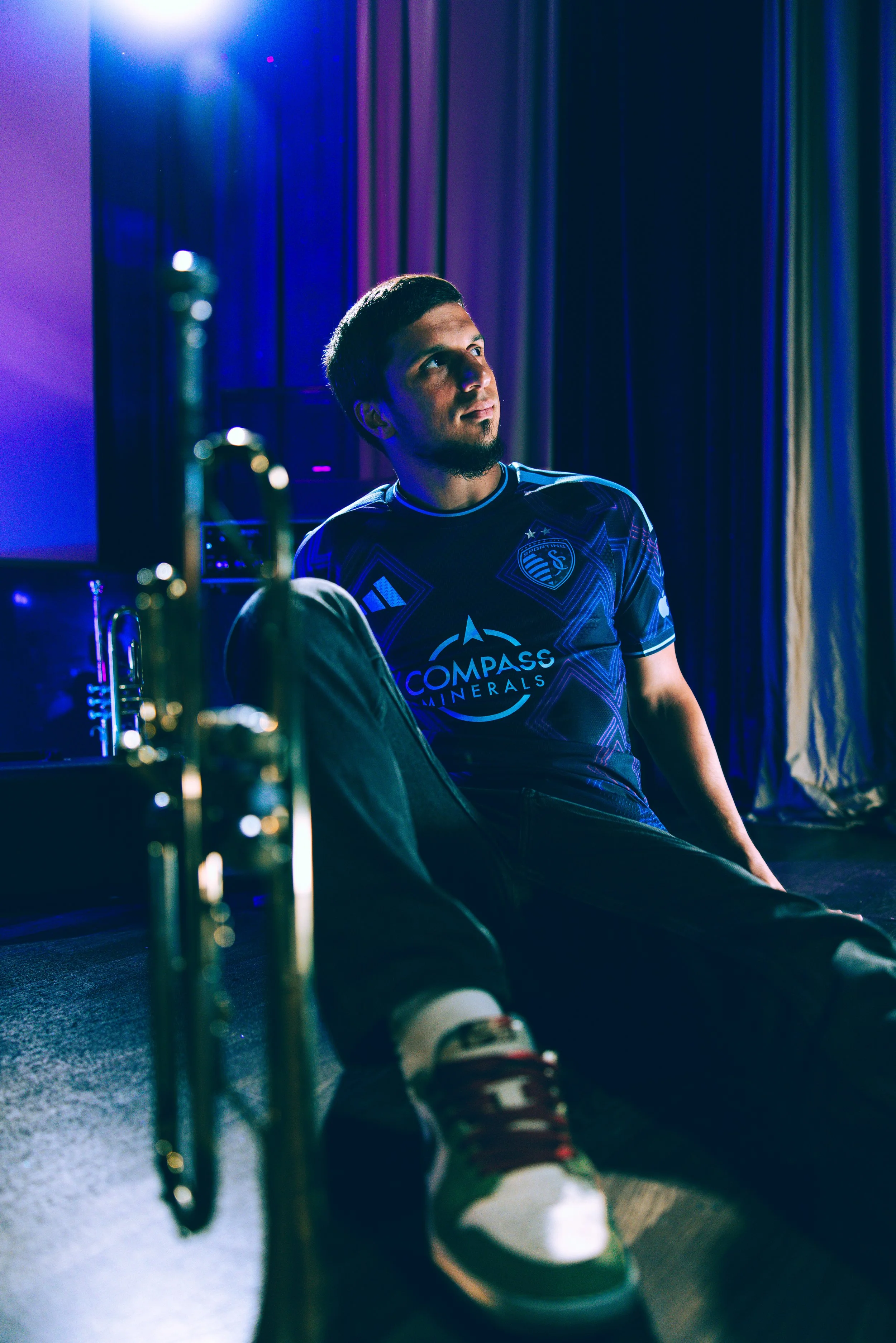
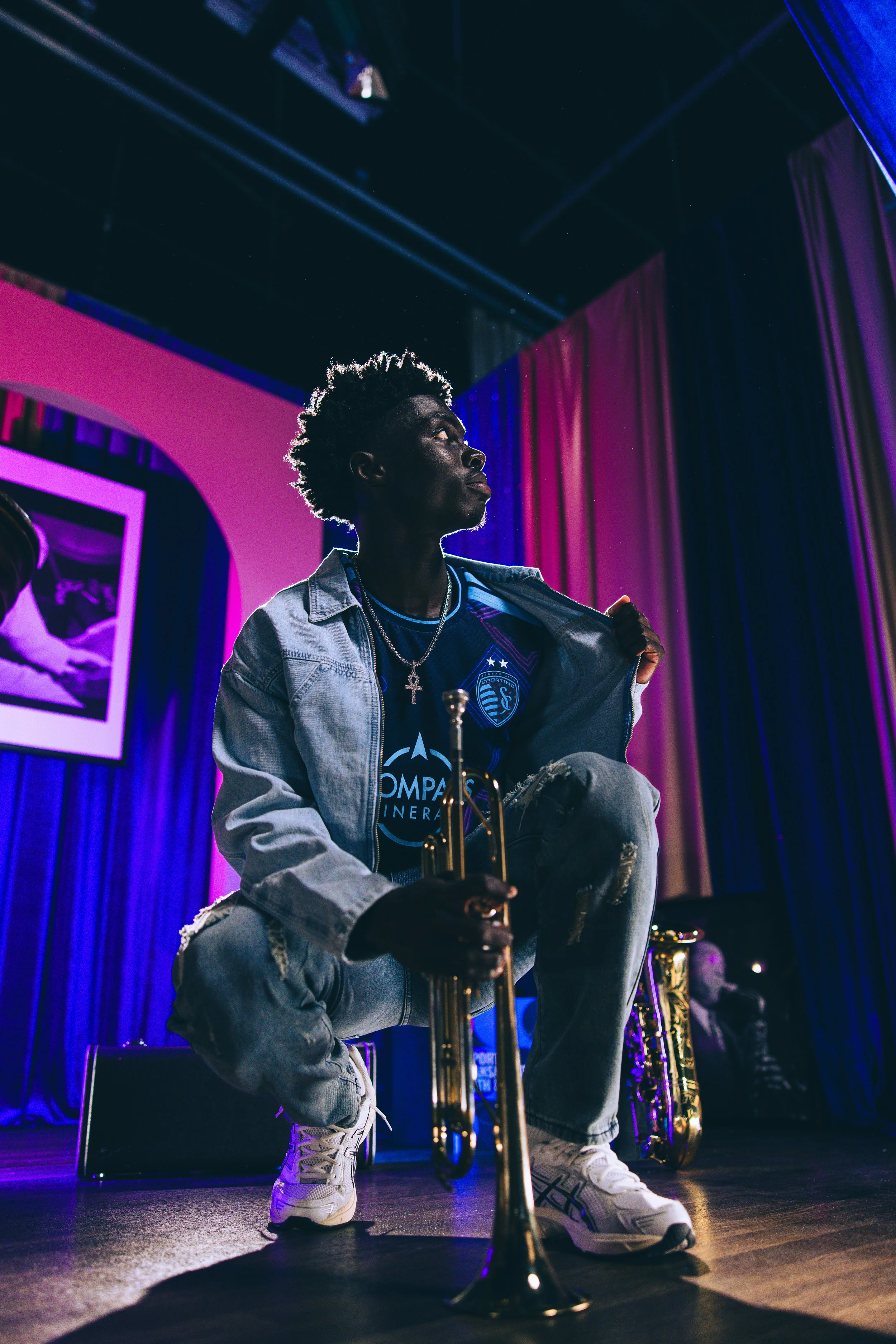
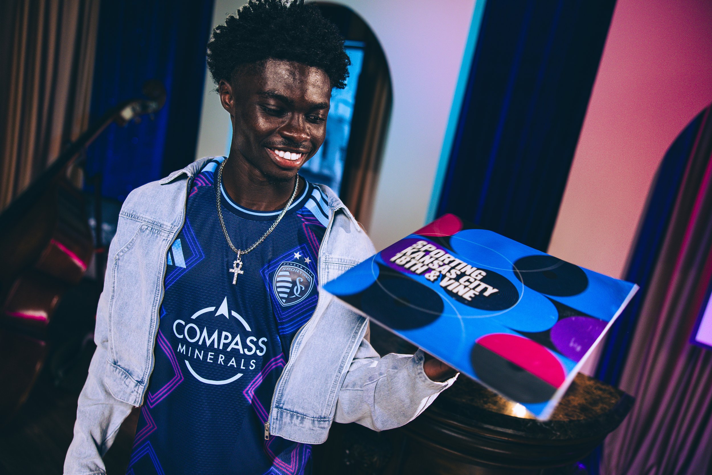
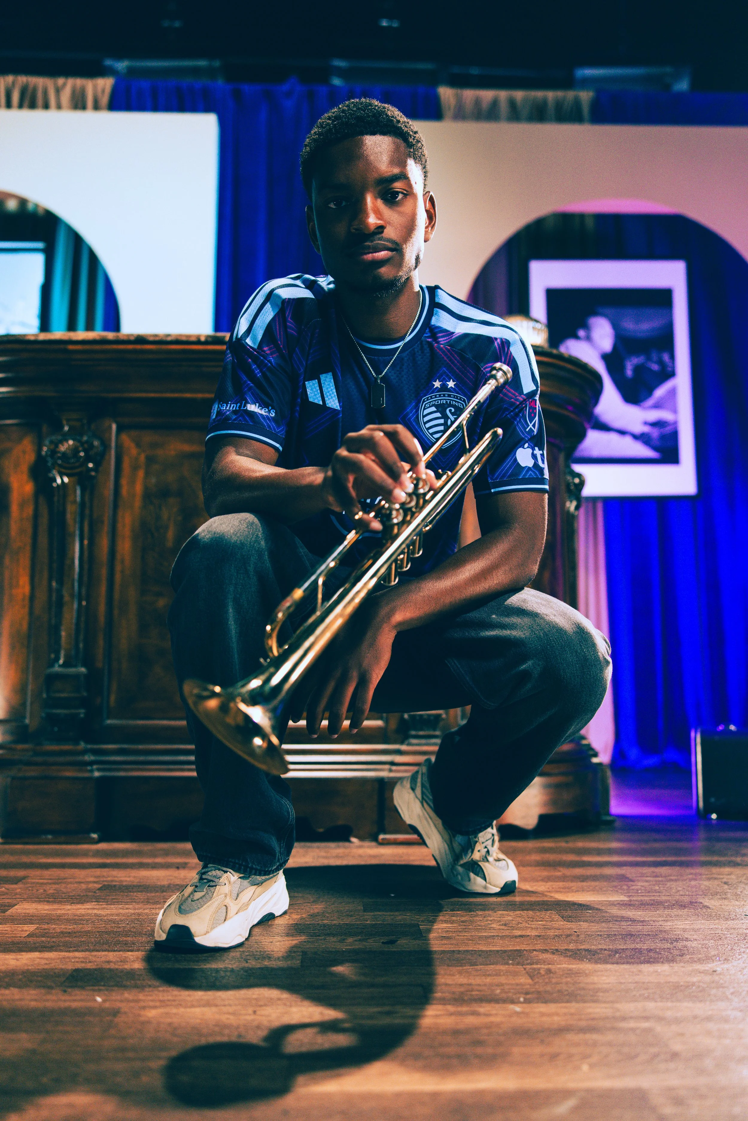
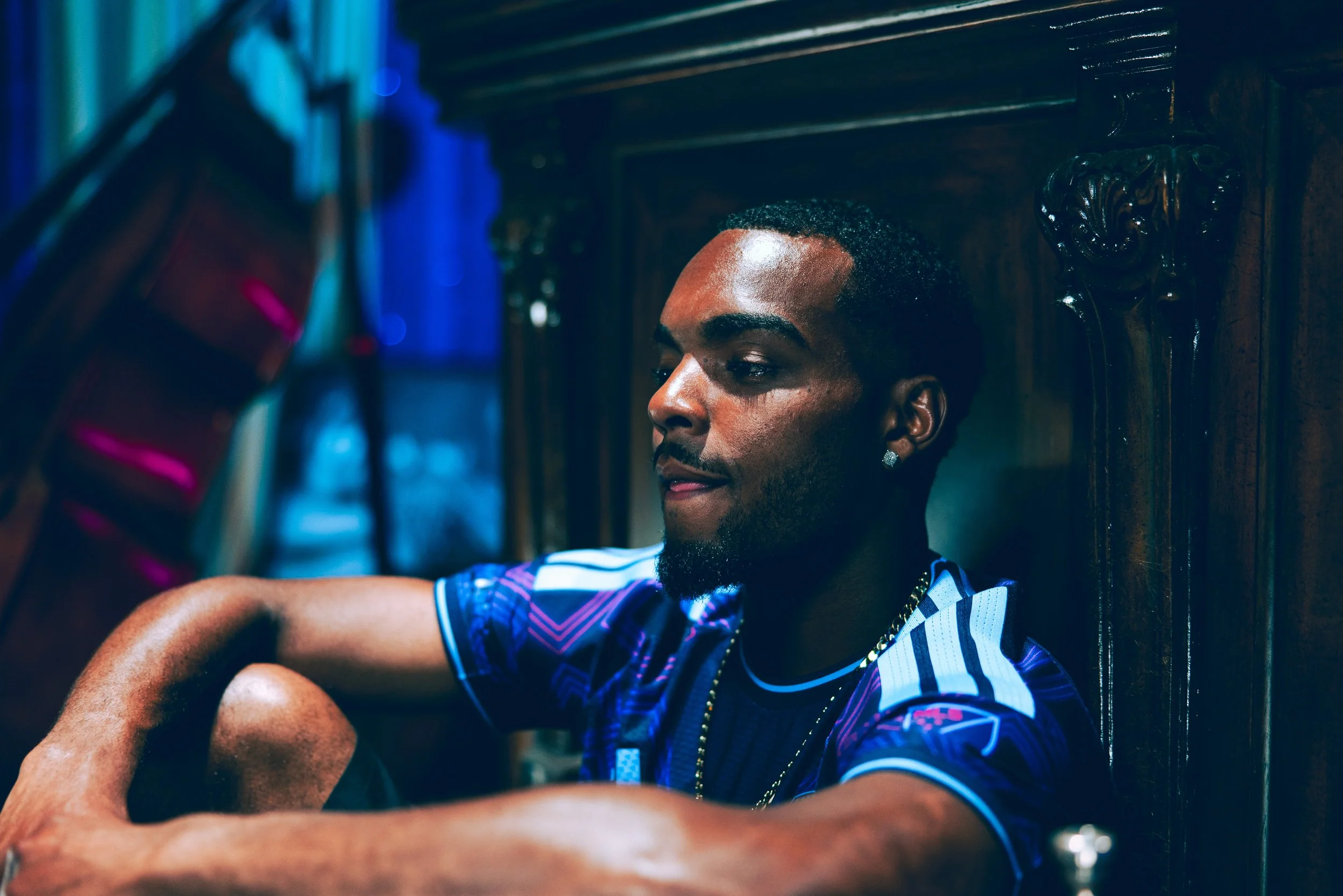
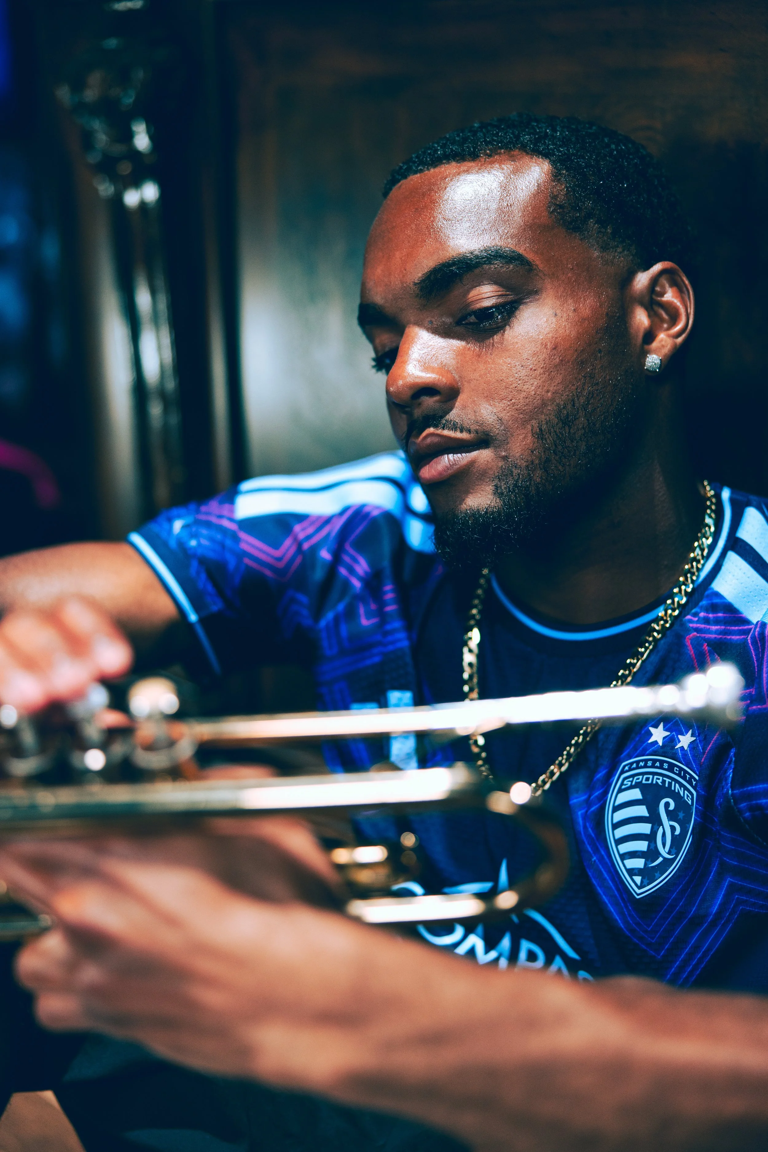
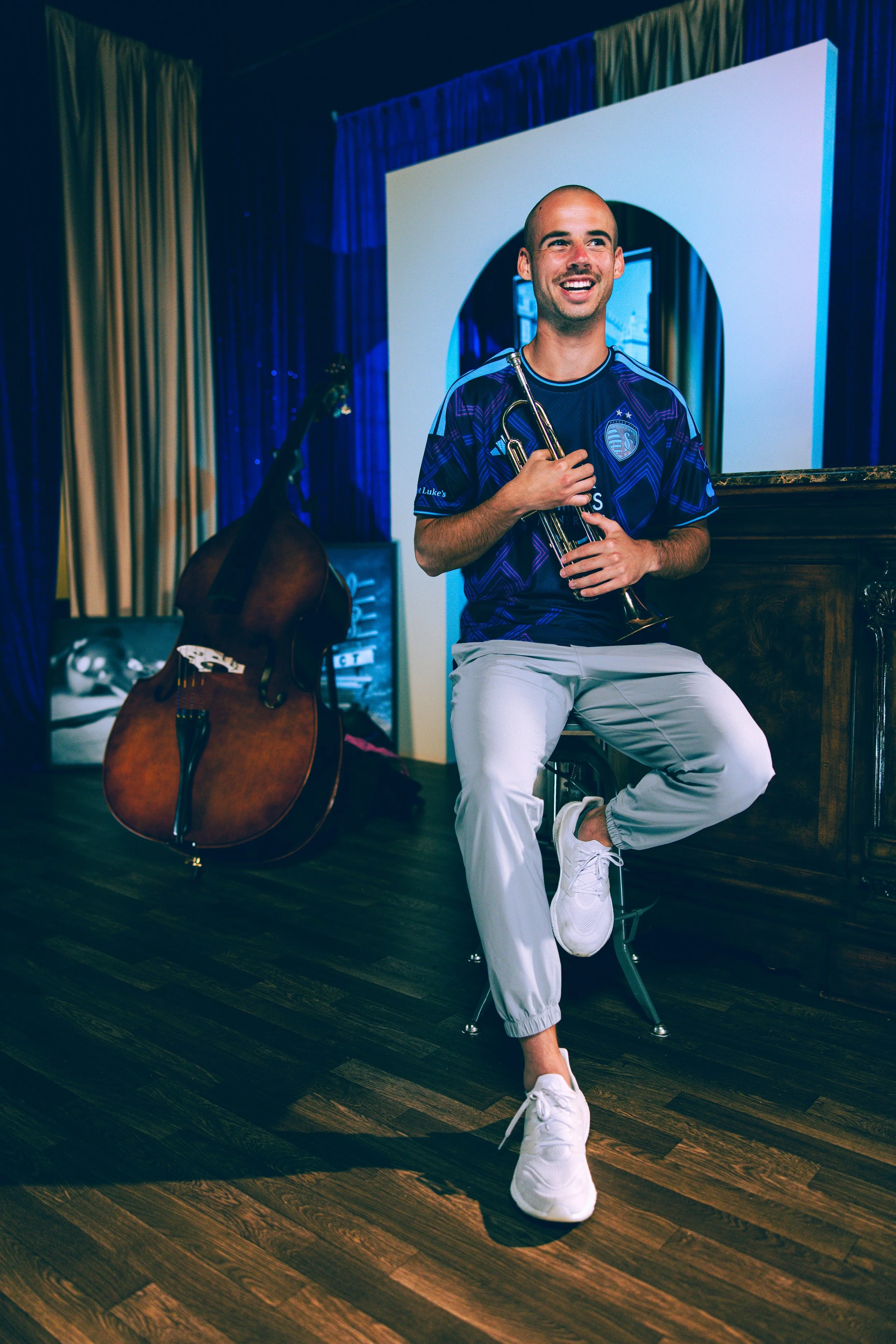
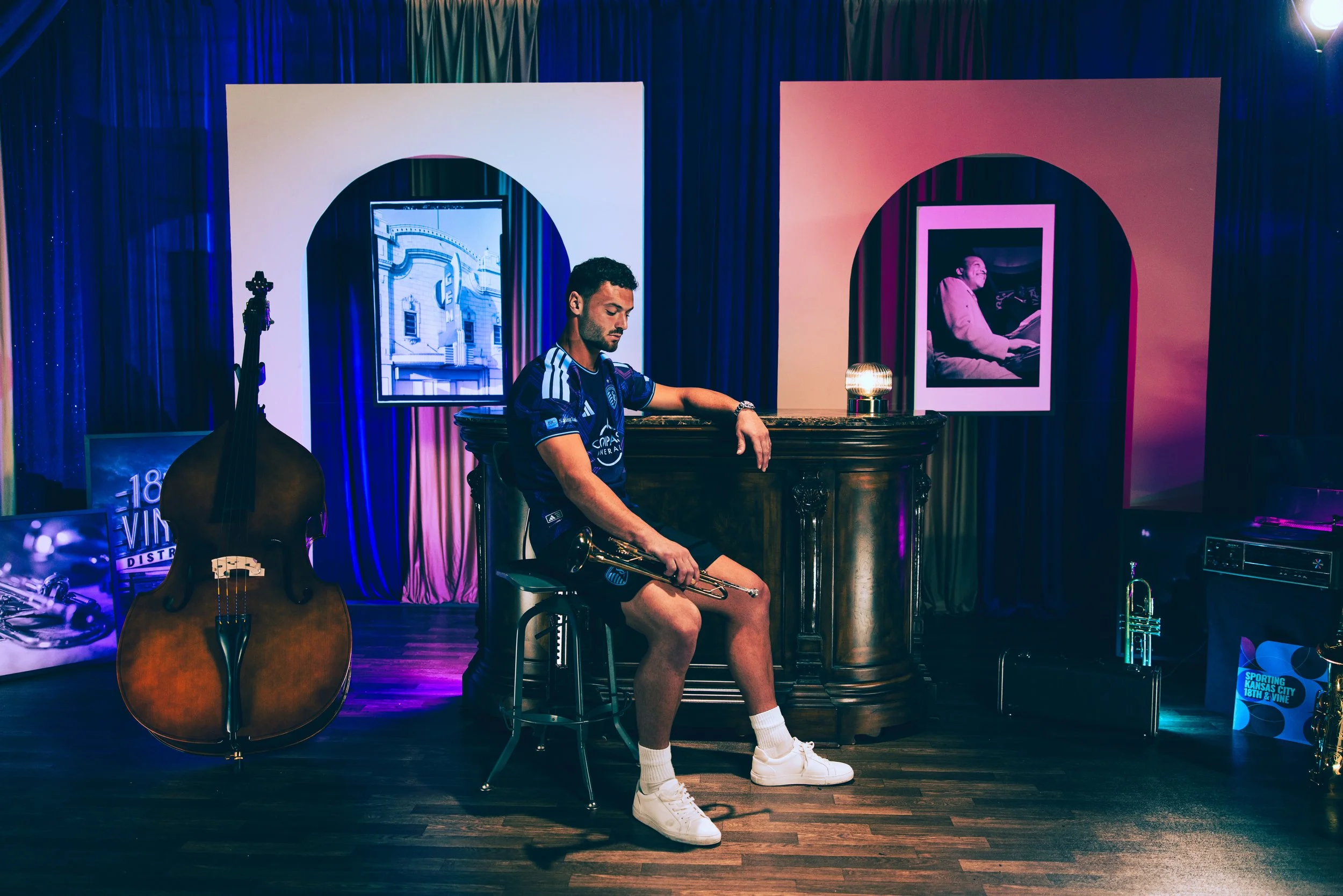
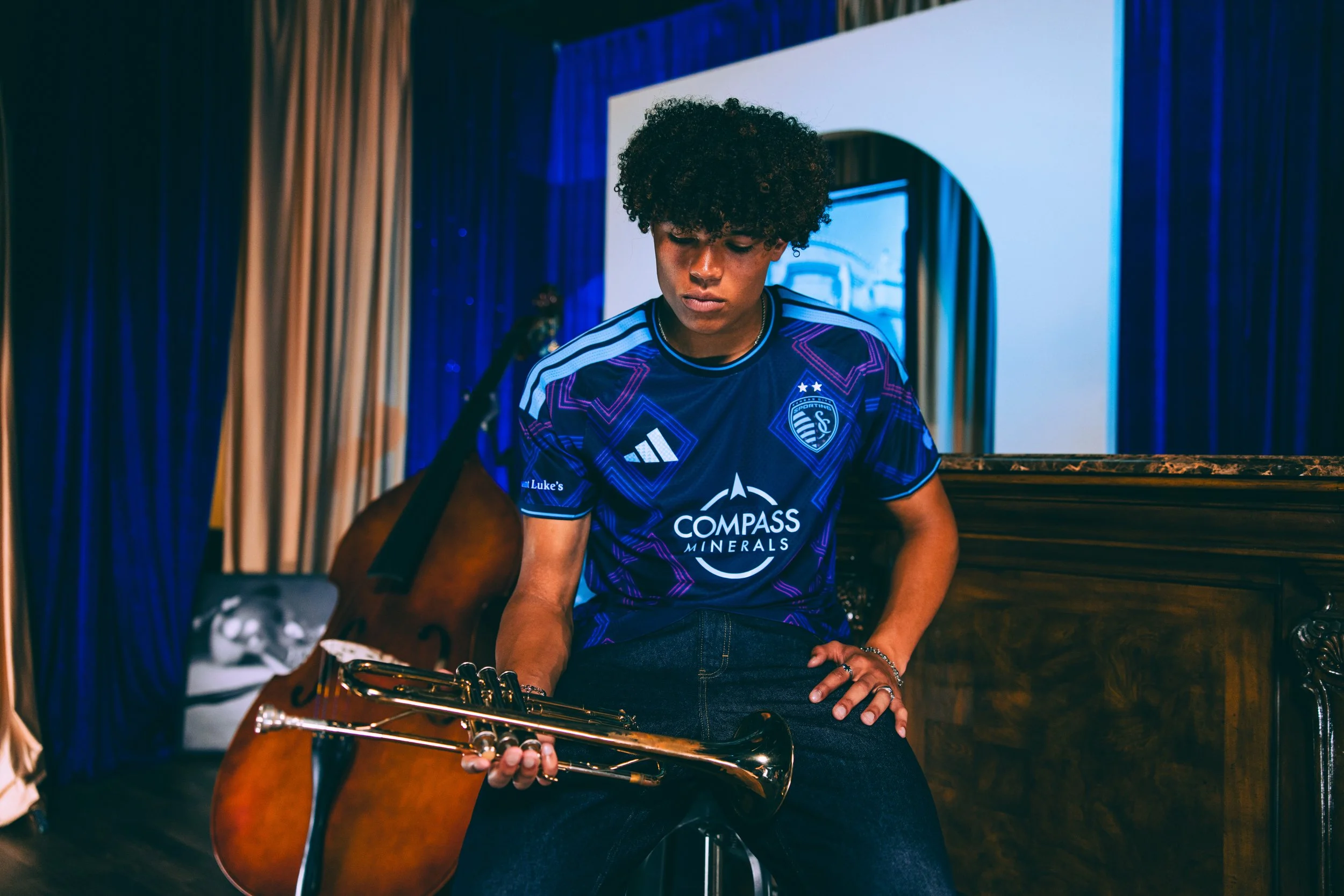
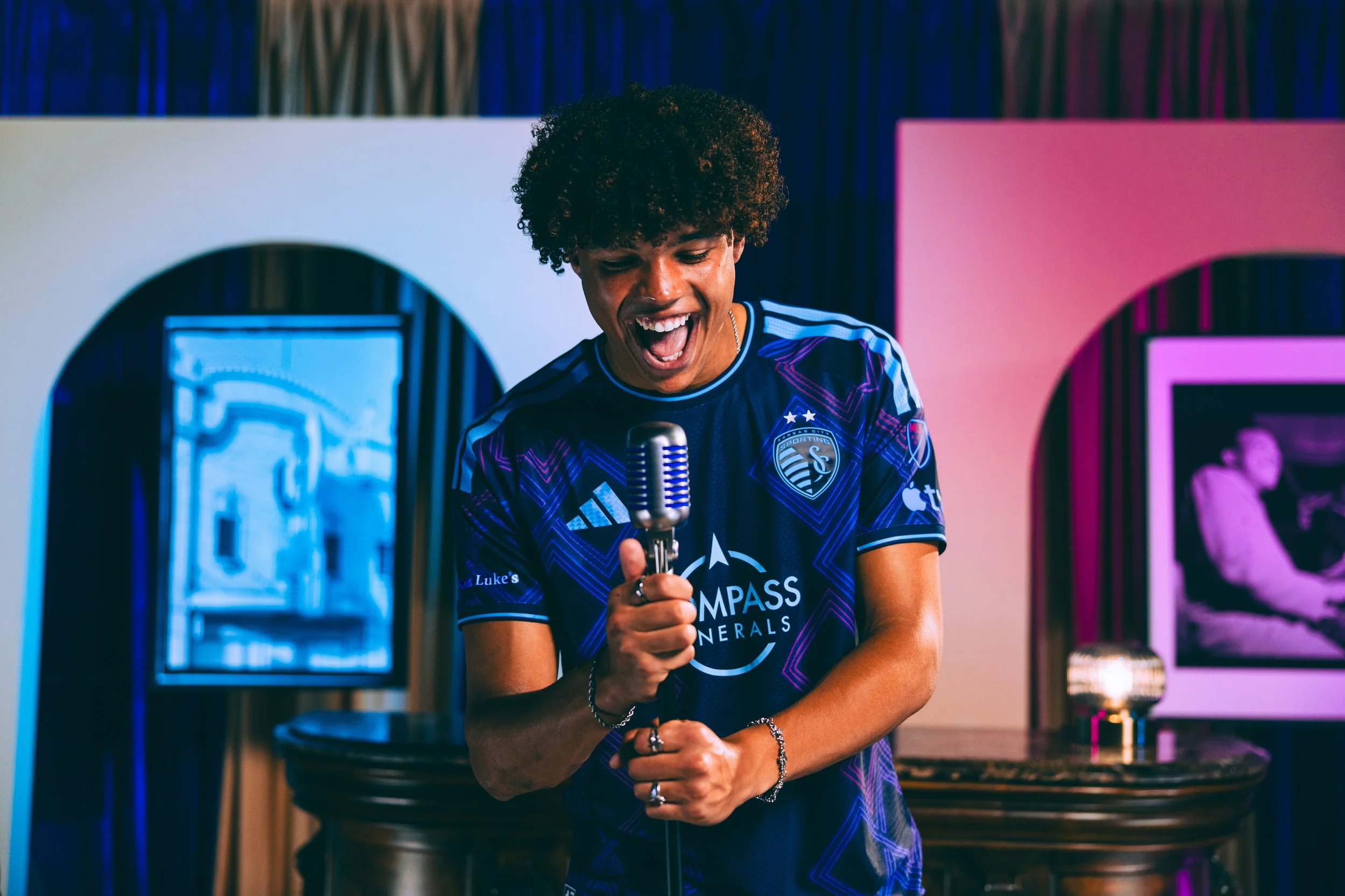
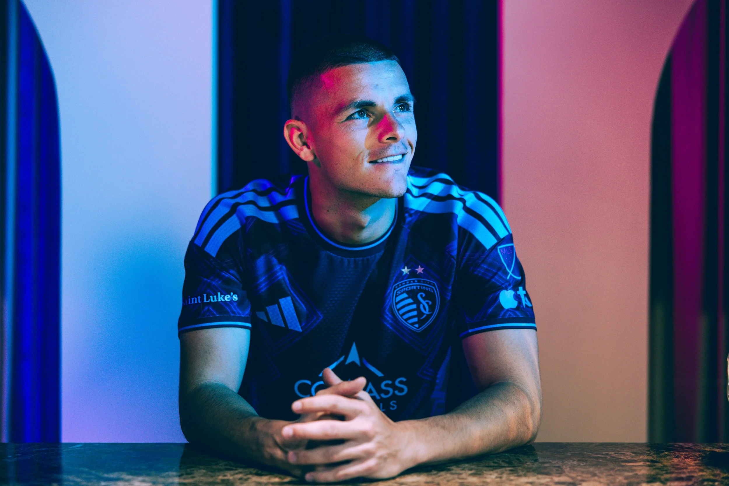
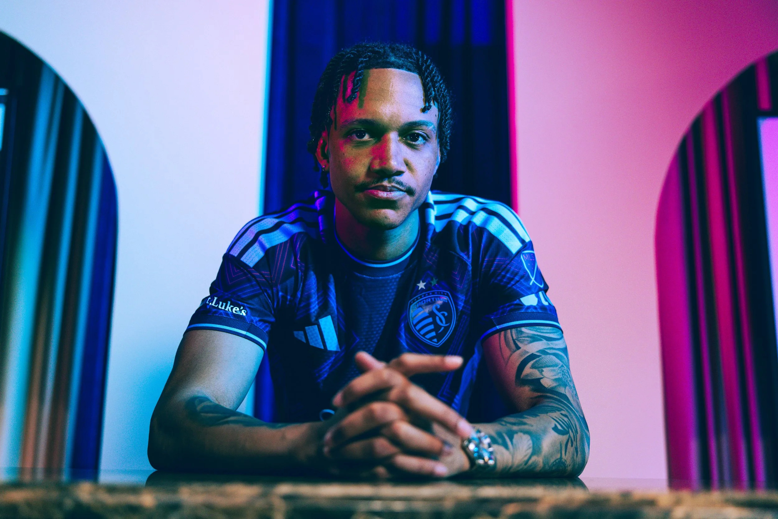
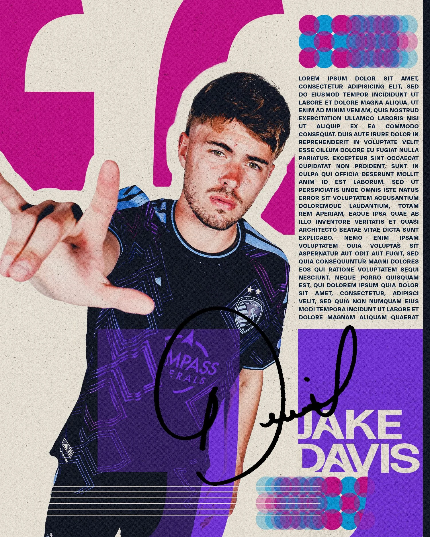
My role during the shoot itself centered heavily around player direction, as seen in the Behind the Scenes photos below. One of the most important parts of creative sports work is understanding that athletes are not professional models. Being placed into a highly produced environment with multiple cameras, lights, and people watching can feel uncomfortable and unnatural very quickly. Because of that, my priority was creating an atmosphere that felt loose, confident, and encouraging, and one where they had a say in how they present themselves through style.
I spent much of the shoot interacting directly with players - guiding poses, adjusting movement, encouraging natural interaction with the set, and keeping energy levels positive throughout long production days. Building trust is essential in those moments. When players feel comfortable, their personalities begin to show naturally, and the imagery becomes far more authentic. My approach has always been centered around helping athletes feel confident and energized rather than overly manufactured, allowing the campaign to feel human instead of staged.
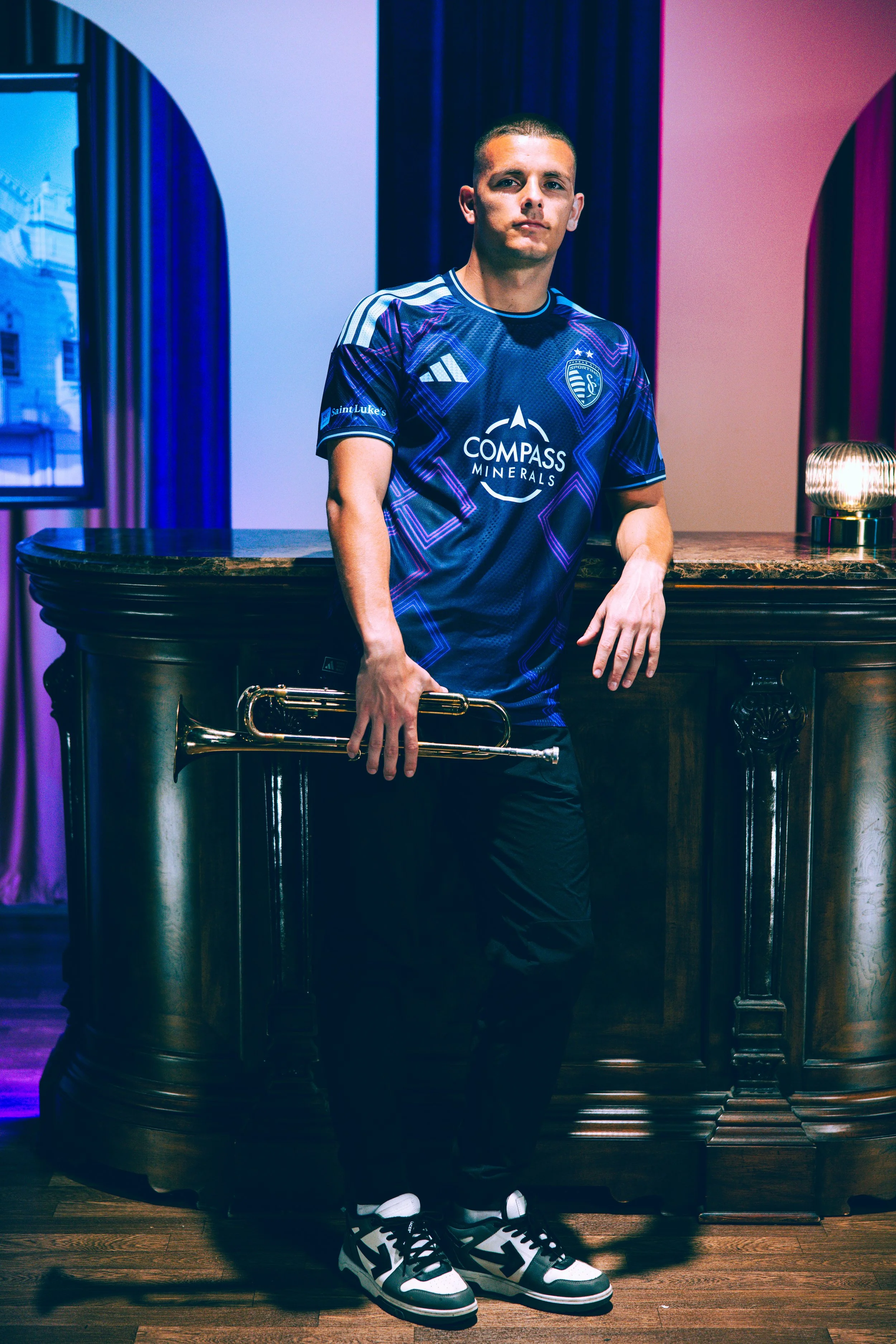
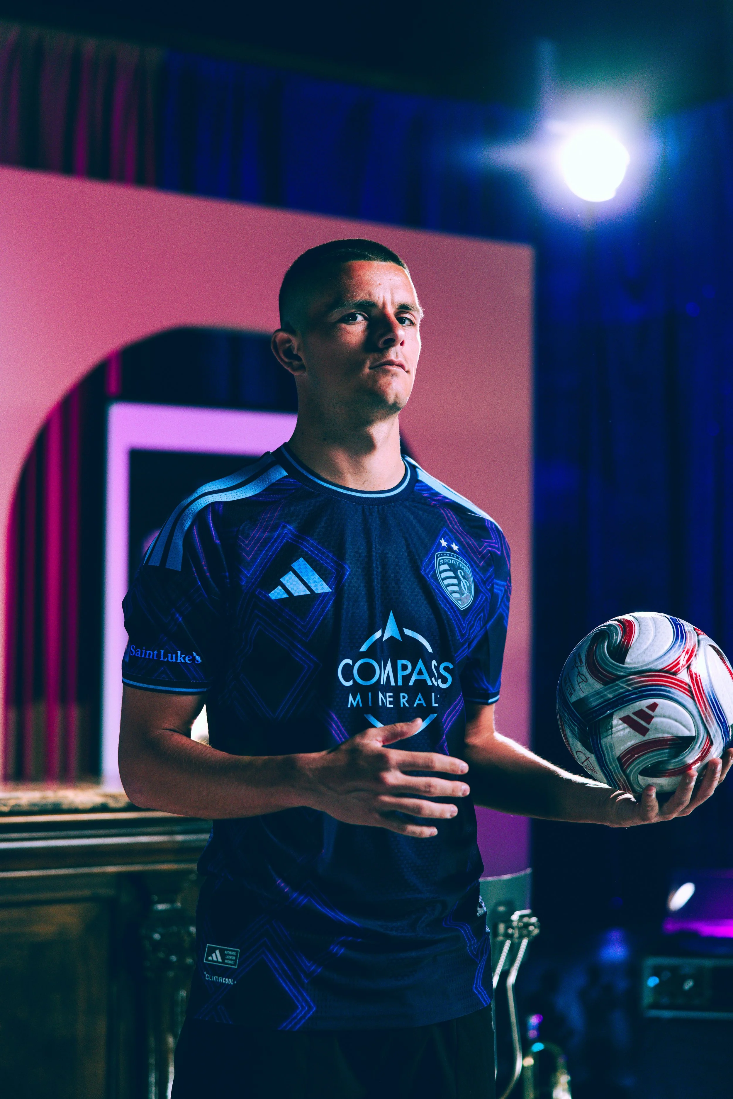
Campaign Assets
Concept Collaboration with Two Circles
Photographers Cassie Florido & Lauren Stefl
Set Design by Waked Creation
Photo Selection, Color Correction & Graphics
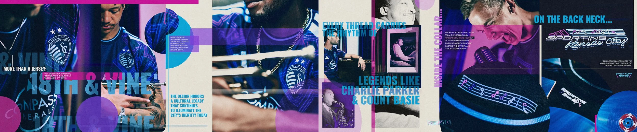
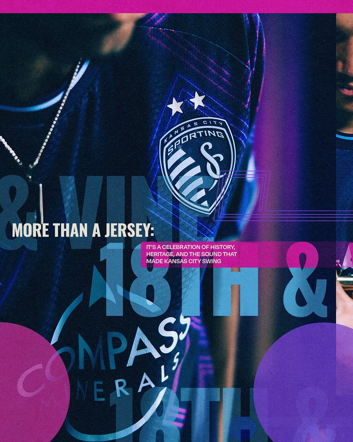
After production wrapped, the project shifted into post-production and campaign asset development. This stage involved extensive photo selection, color correction, retouching, and graphic integration across launch materials.
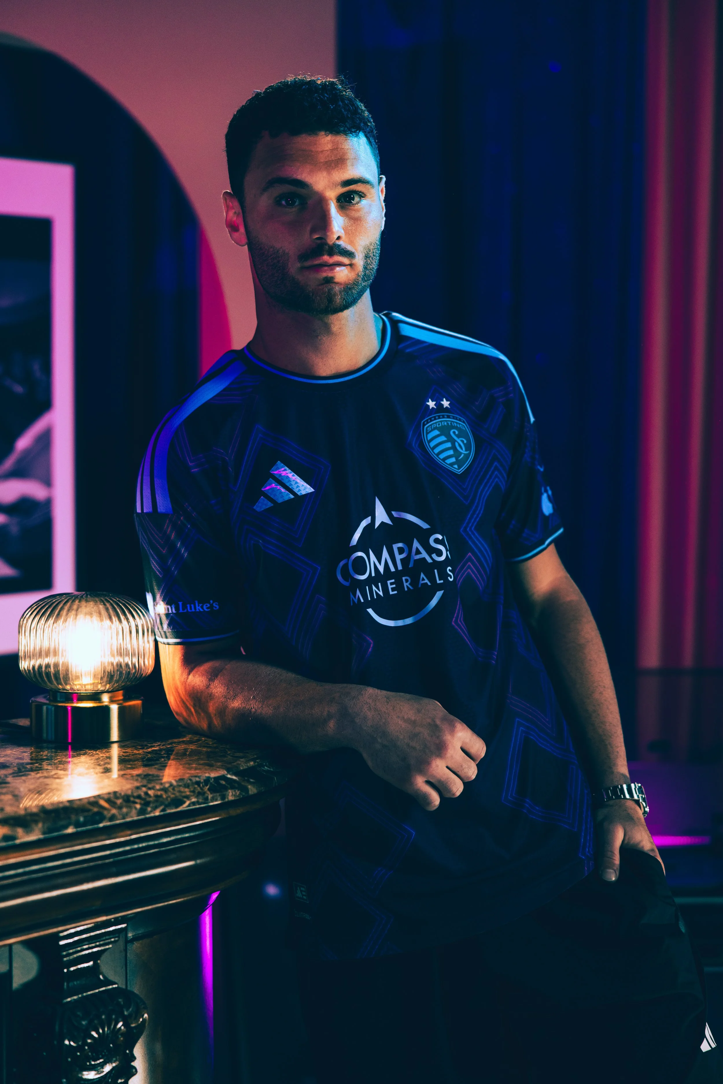
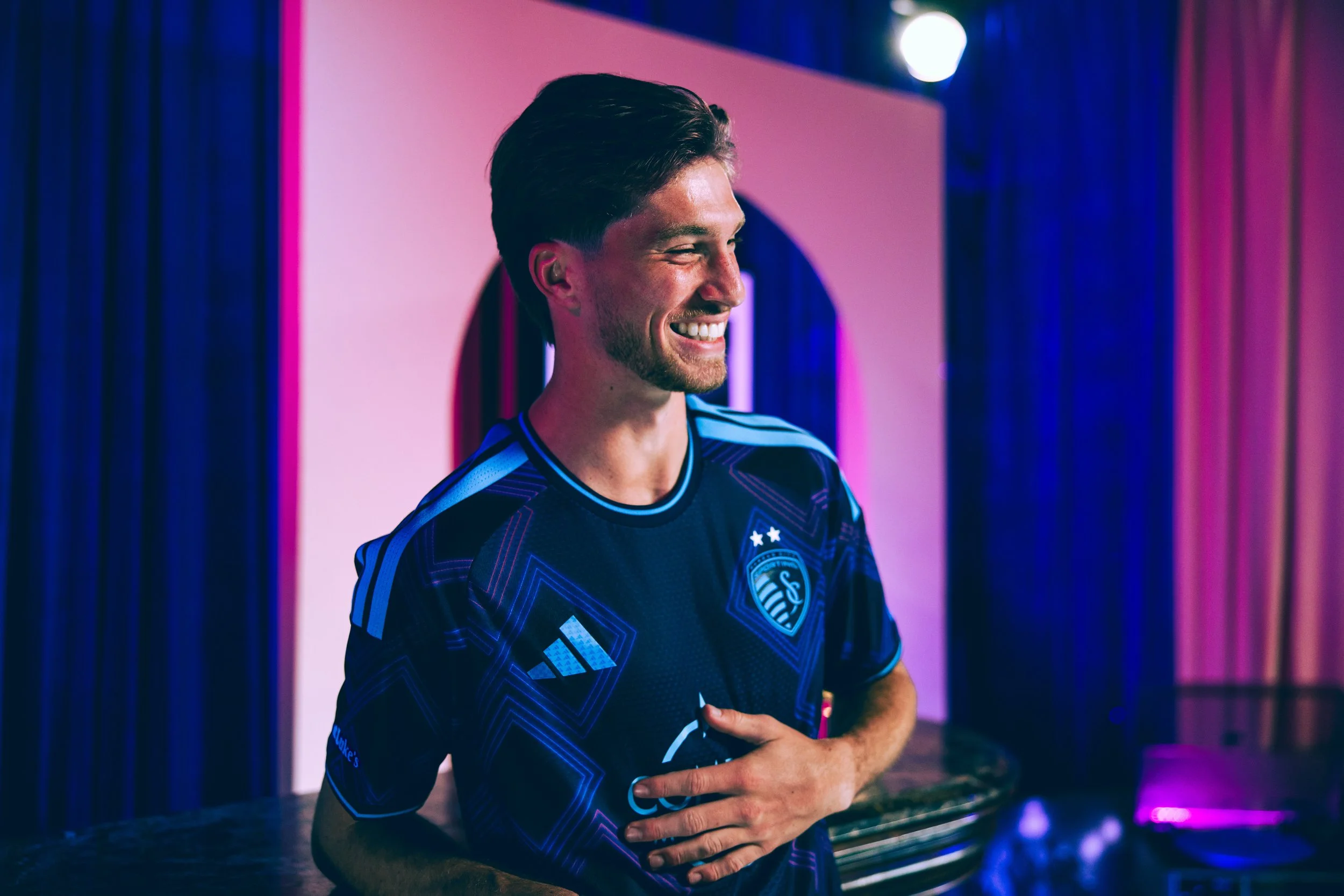
The image selection process was incredibly intentional. Every frame needed to accomplish multiple goals simultaneously: showcase the jersey in its best light, represent the players confidently, and reinforce the emotional tone established during the shoot. There is a responsibility that comes with choosing how athletes are presented publicly, and I take that seriously. My goal is always to make players feel like the strongest version of themselves on screen. When athletes trust that you will present them authentically and confidently, it strengthens future collaboration and creates a healthier creative environment overall.
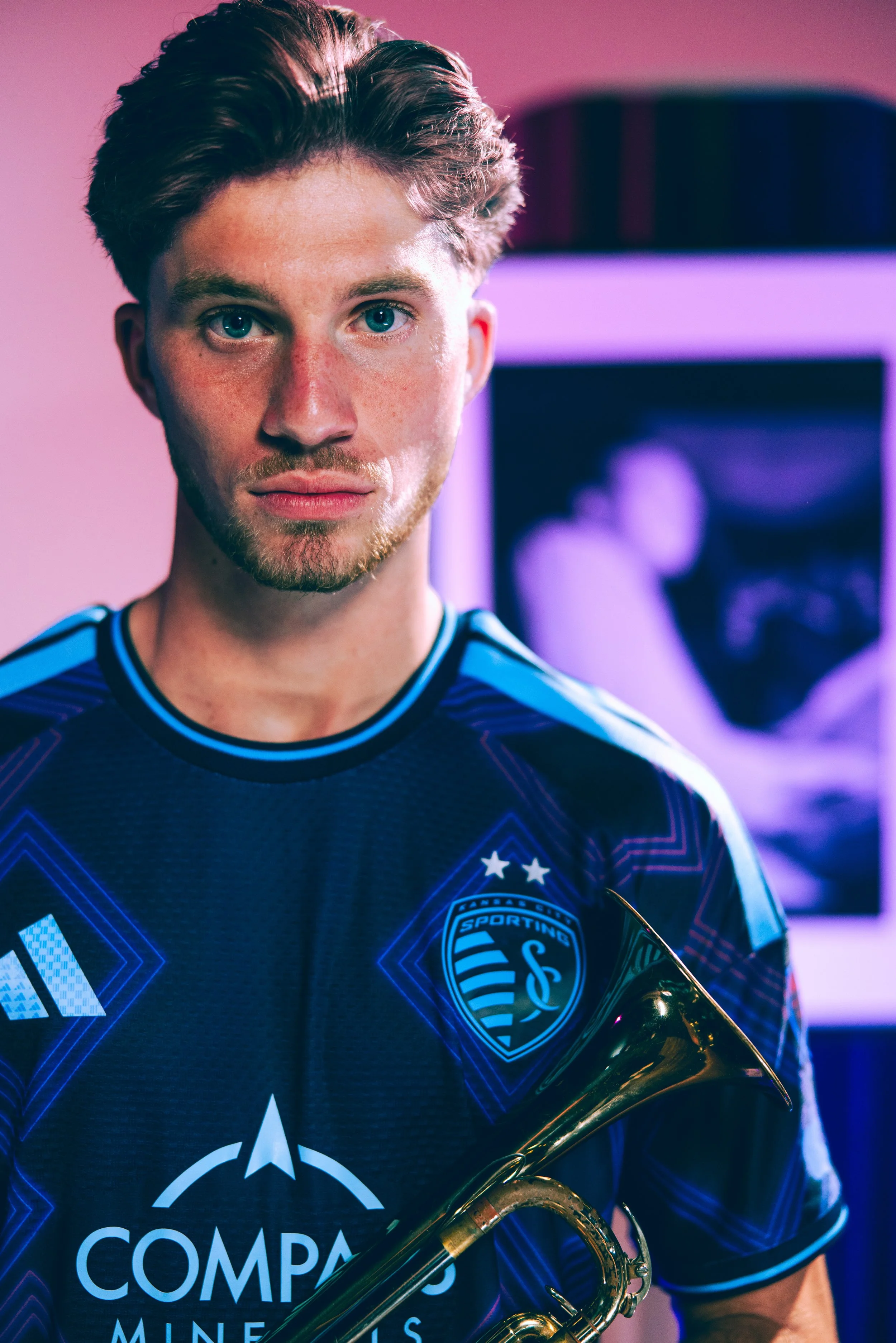
At the same time, the campaign still needed to function as a product launch. The jersey itself remained central throughout the entire editing and asset-building process. Particular attention was given to sponsor visibility, jersey detailing, texture, and movement while maintaining the cinematic tone of the campaign.
Beyond the product, though, this launch also carried a larger storytelling responsibility. With a relatively new roster, the campaign became an opportunity to introduce players to fans in a more personal way. The visuals were designed not only to market a jersey, but to help supporters begin forming emotional connections with personalities, attitudes, and identities within the team. In many ways, the campaign became part of the process of helping fans discover “their guy” going into the season.


Design Process
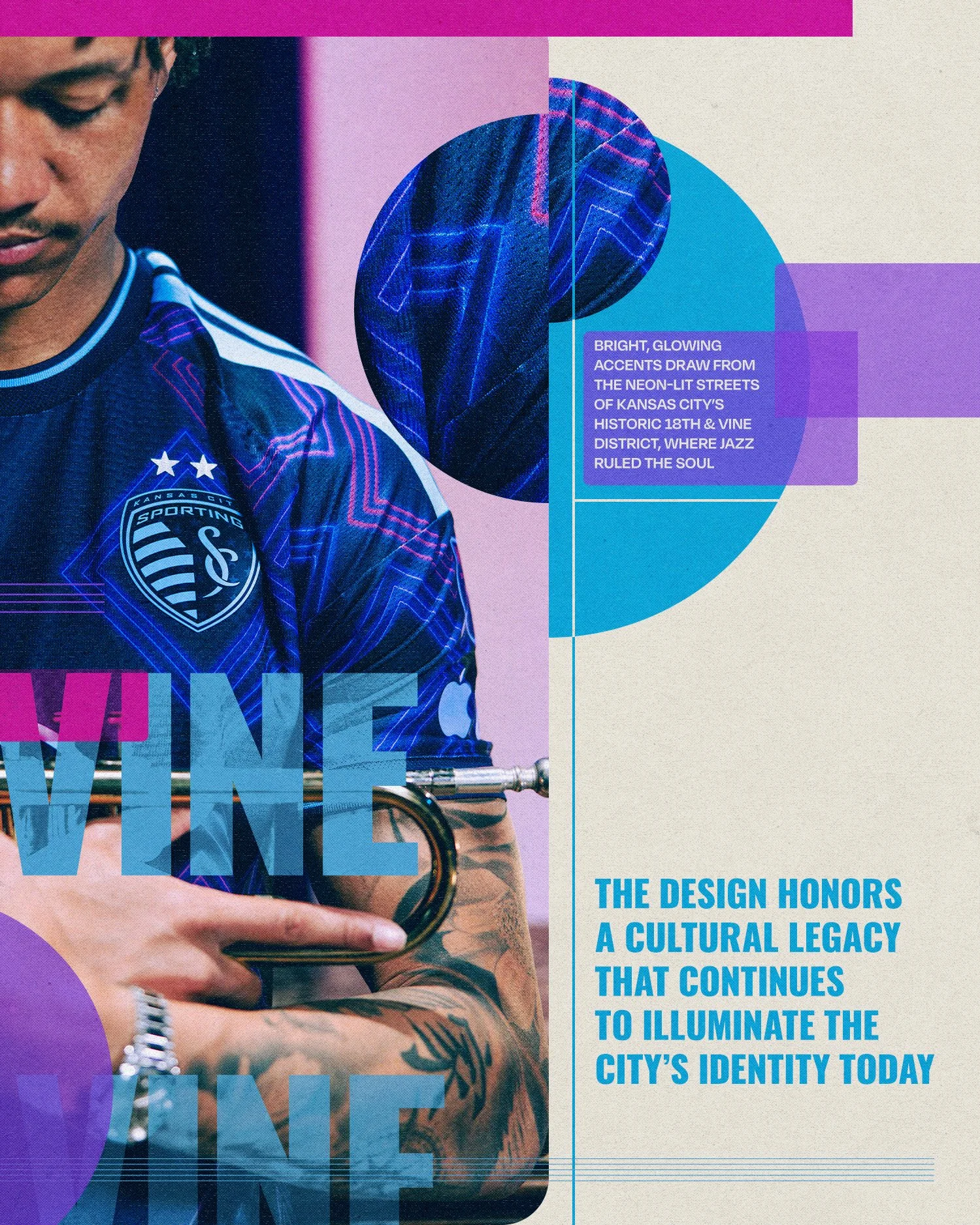
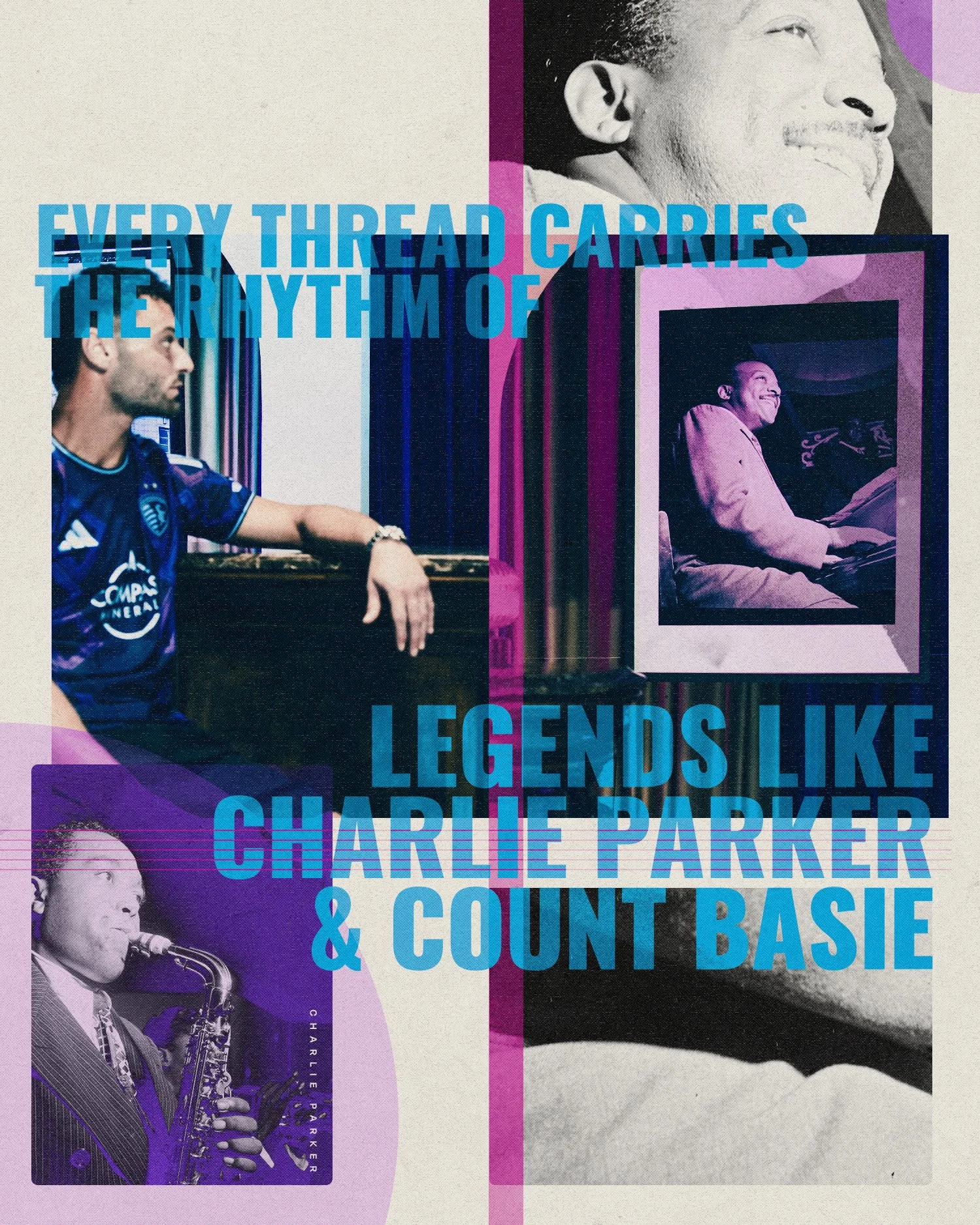
The design process began with immersion. I spent time studying the visual language surrounding Kansas City Jazz and the historic 18th & Vine district - not just the music itself, but the texture, movement, improvisation, and emotion associated with it. Much of the early creative work focused on understanding how jazz could translate visually into a sports identity without becoming overly literal or performative.
That exploration led to a series of graphic studies centered around influence and expression. I looked at vintage print design, old concert posters, the introduction of record cover design, photography, typography, and the layered imperfections that made the era feel human and alive. There was an intentional balance between structure and looseness throughout the process - creating a visual dichotomy between the refined systems required in professional sports branding and the improvisational spirit that defines jazz music.
Patterns and textures became an important storytelling device within the project. Rather than relying on flat graphics, I wanted the visuals to feel tactile and atmospheric. Grain, contrast, layering, and rhythm all played a role in helping the campaign feel grounded in history while still existing in a modern sports space. Underneath all of it was a carefully constructed grid system that ensured every asset - whether social, print, apparel, or environmental - remained cohesive across the entire campaign.
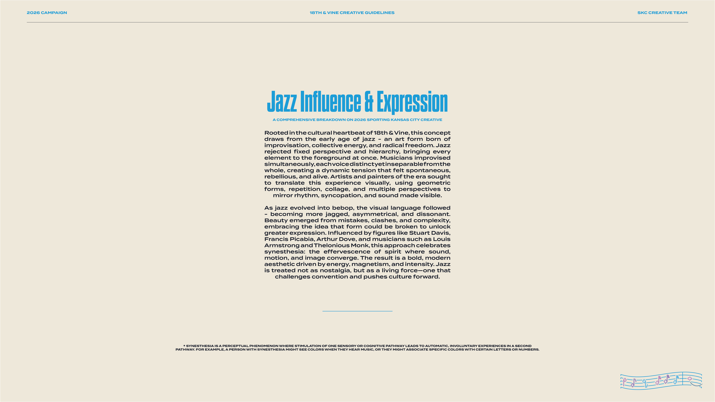
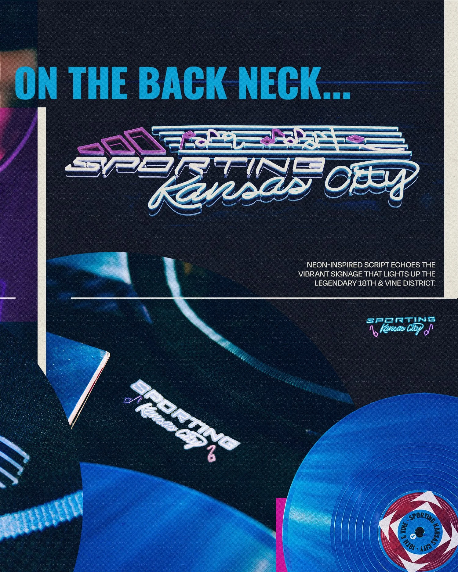
Jazz Influence & Expression
A Comprehensive Breakdown on Sporting Kansas City’s Seasonal Creative
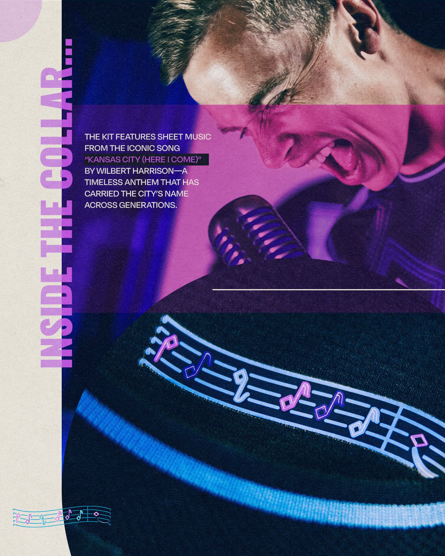
Rooted in the cultural heartbeat of 18th & Vine, this concept draws from the early age of jazz - an art form born of improvisation, collective energy, and radical freedom. Jazz rejected fixed perspective and hierarchy, bringing every element to the foreground at once. Musicians improvised simultaneously, each voice distinct yet inseparable from the whole, creating a dynamic tension that felt spontaneous, rebellious, and alive. Artists and painters of the era sought to translate this experience visually, using geometric forms, repetition, collage, and multiple perspectives to mirror rhythm, syncopation, and sound made visible.
As jazz evolved into bebop, the visual language followed - becoming more jagged, asymmetrical, and dissonant. Beauty emerged from mistakes, clashes, and complexity, embracing the idea that form could be broken to unlock greater expression. Influenced by figures like Stuart Davis, Francis Picabia, Arthur Dove, and musicians such as Louis Armstrong and Thelonious Monk, this approach celebrates synesthesia: the effervescence of spirit where sound, motion, and image converge. The result is a bold, modern aesthetic driven by energy, magnetism, and intensity. Jazz is treated not as nostalgia, but as a living force—one that challenges convention and pushes culture forward.

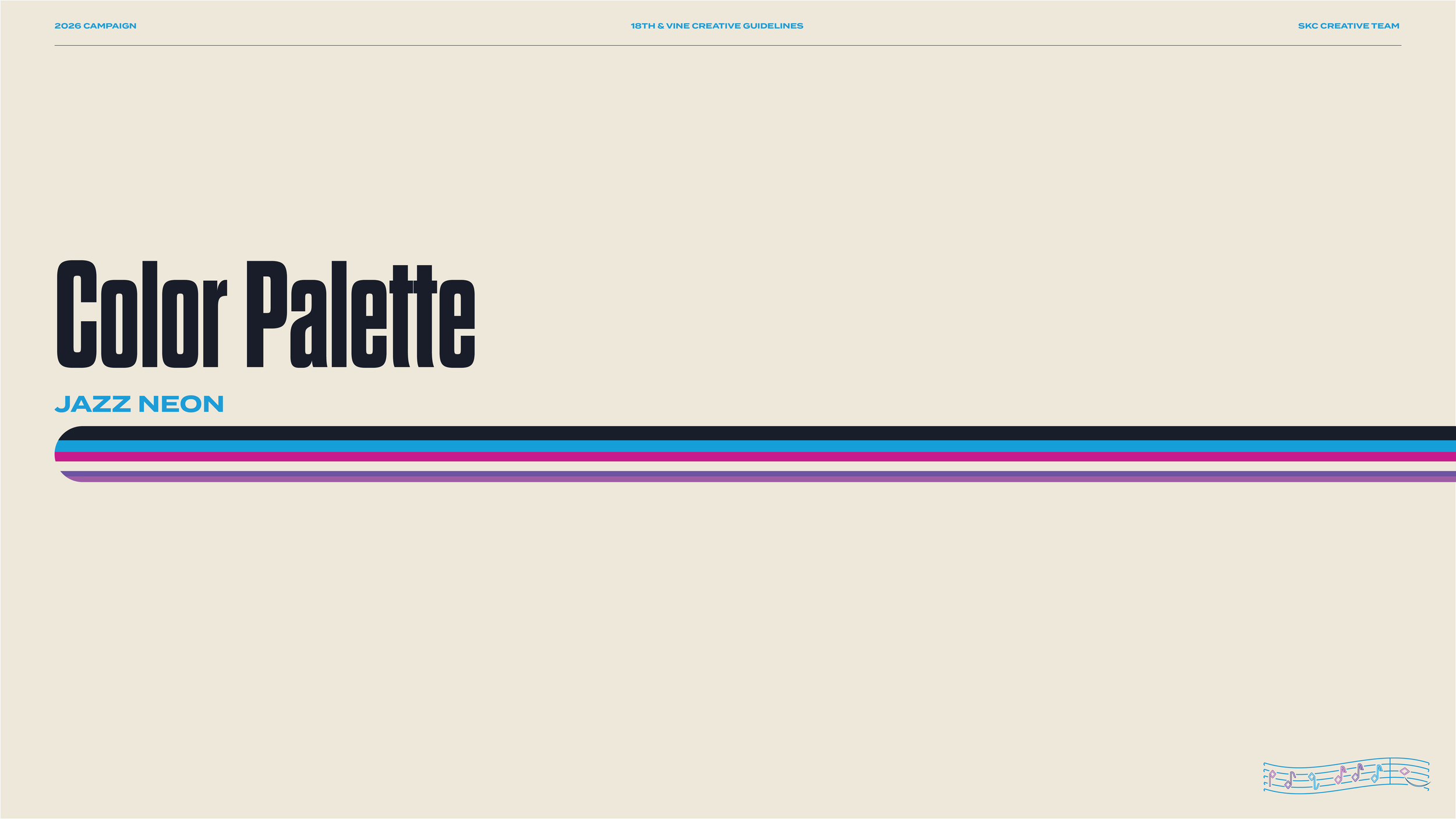
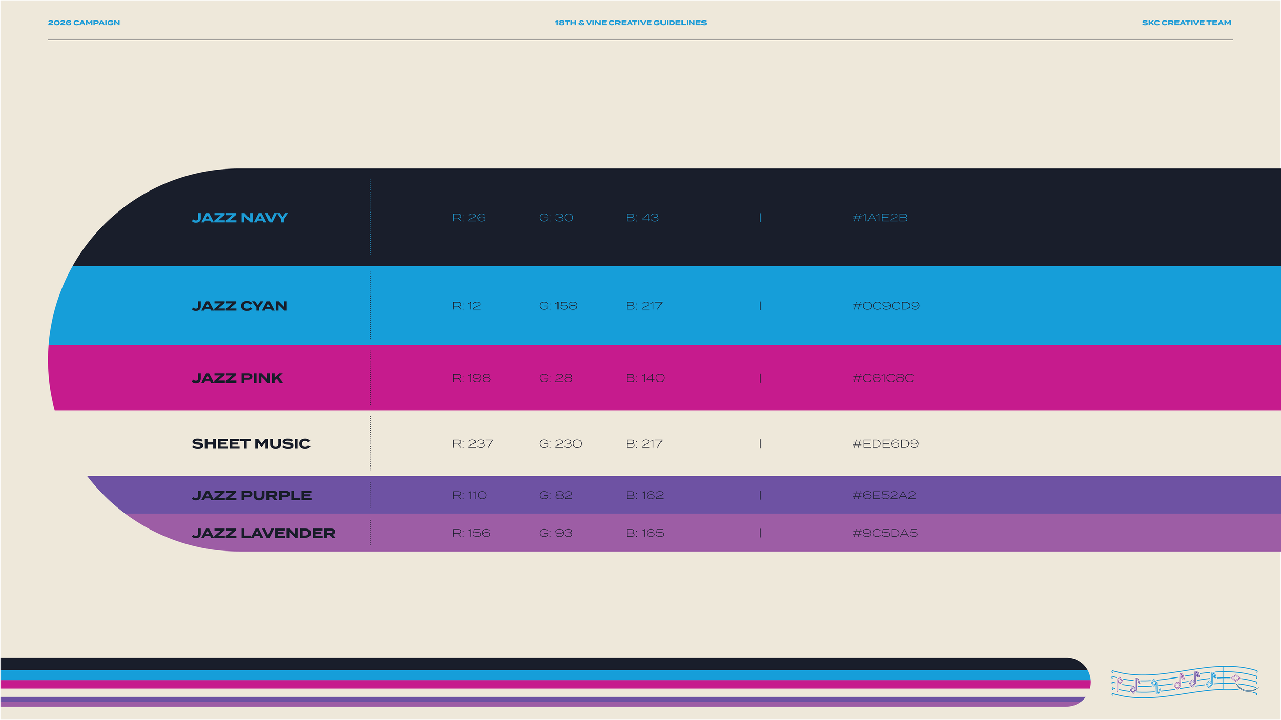
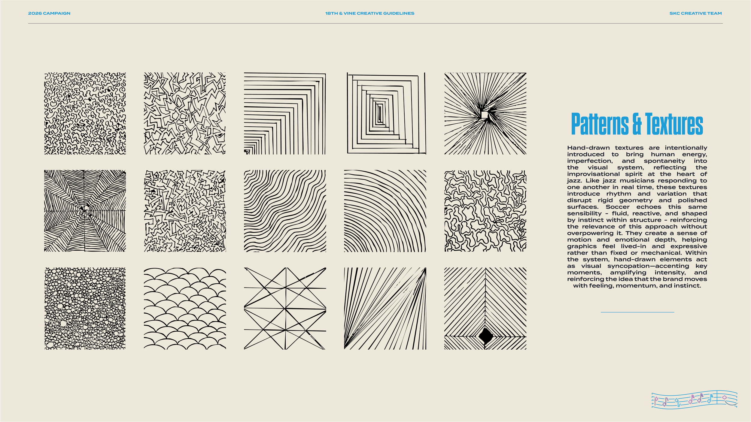
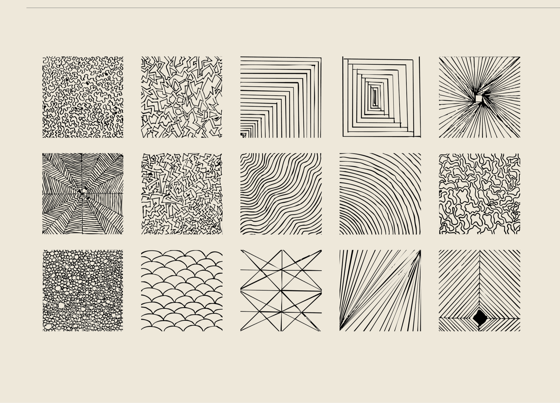
Patterns & Textures
Improvisation Through Texture
Hand-drawn textures are intentionally introduced to bring human energy, imperfection, and spontaneity into the visual system, reflecting the improvisational spirit at the heart of jazz. Like jazz musicians responding to one another in real time, these textures introduce rhythm and variation that disrupt rigid geometry and polished surfaces. Soccer echoes this same sensibility - fluid, reactive, and shaped by instinct within structure - reinforcing the relevance of this approach without overpowering it. They create a sense of motion and emotional depth, helping graphics feel lived-in and expressive rather than fixed or mechanical. Within the system, hand-drawn elements act as visual syncopation - accenting key moments, amplifying intensity, and reinforcing the idea that the brand moves with feeling, momentum, and instinct.
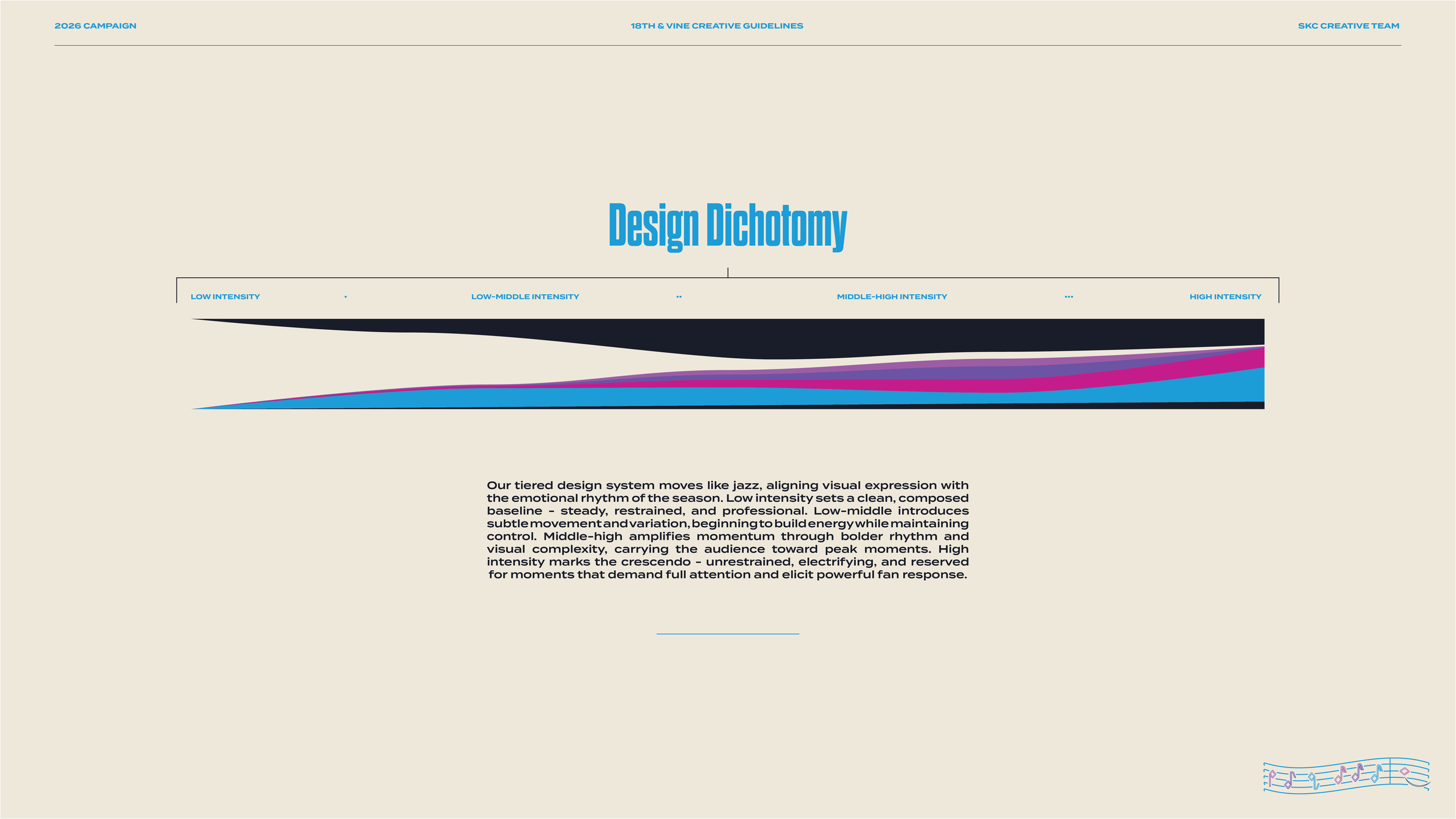
Design Dichotomy
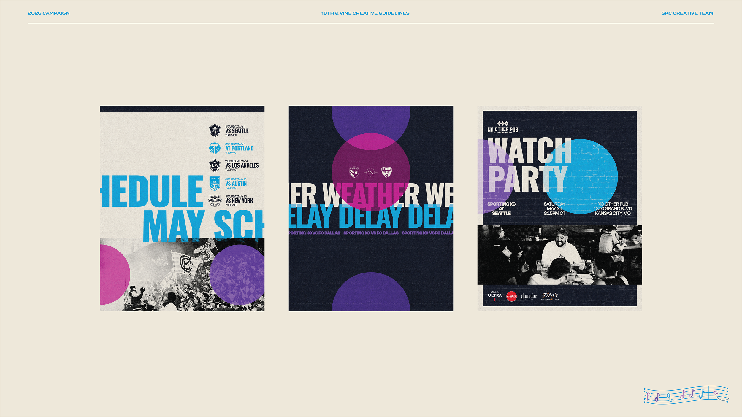
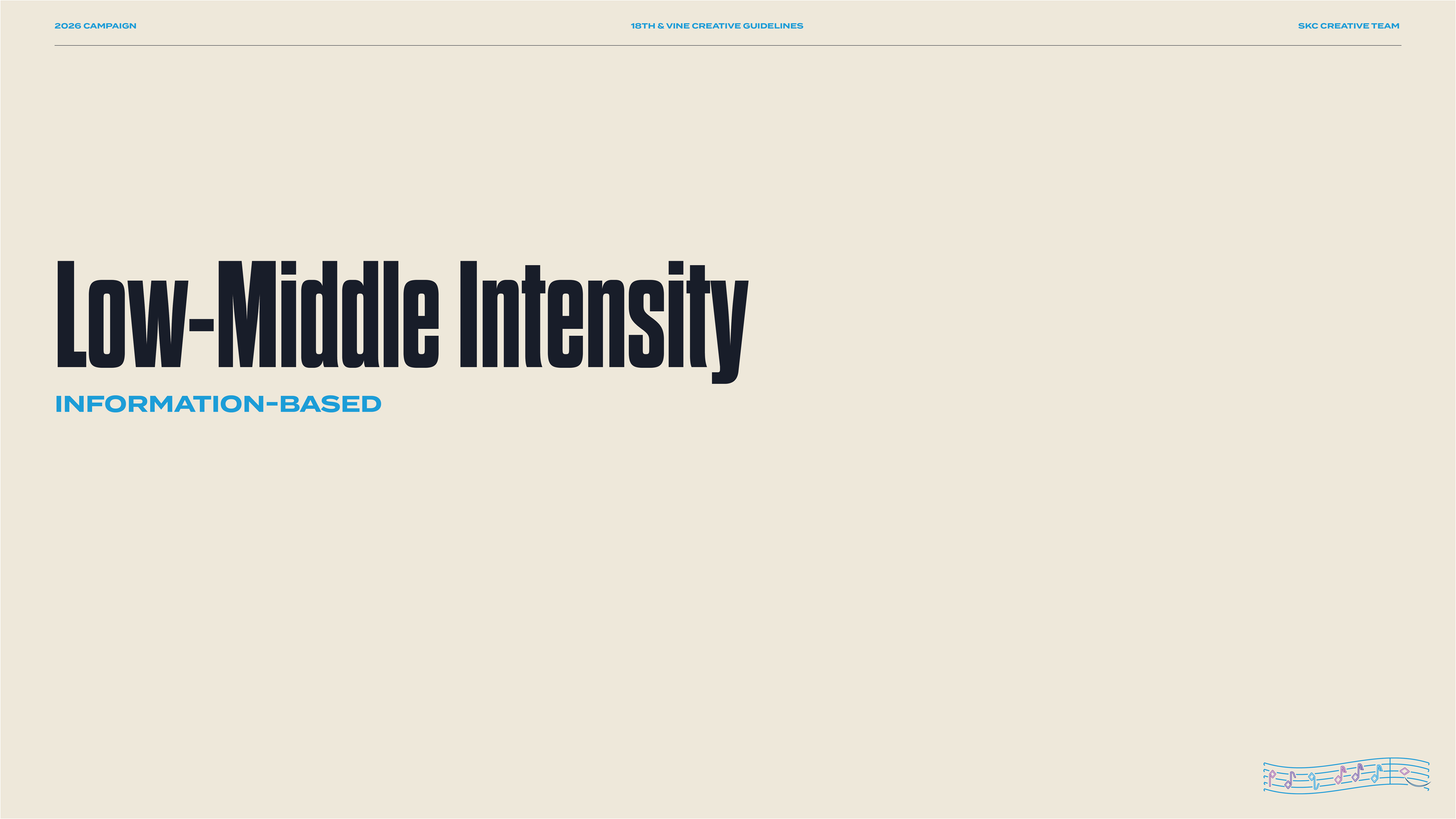
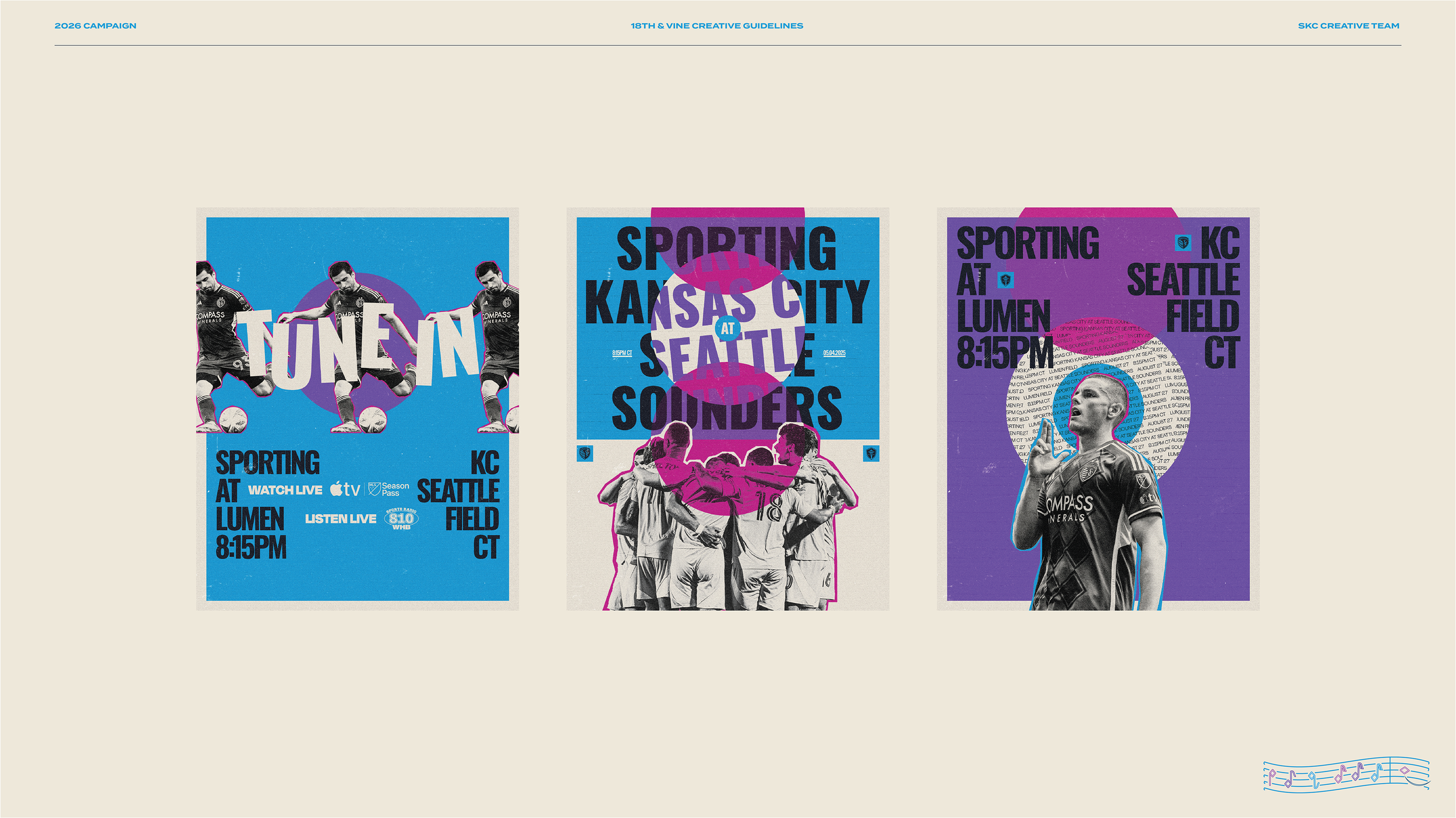
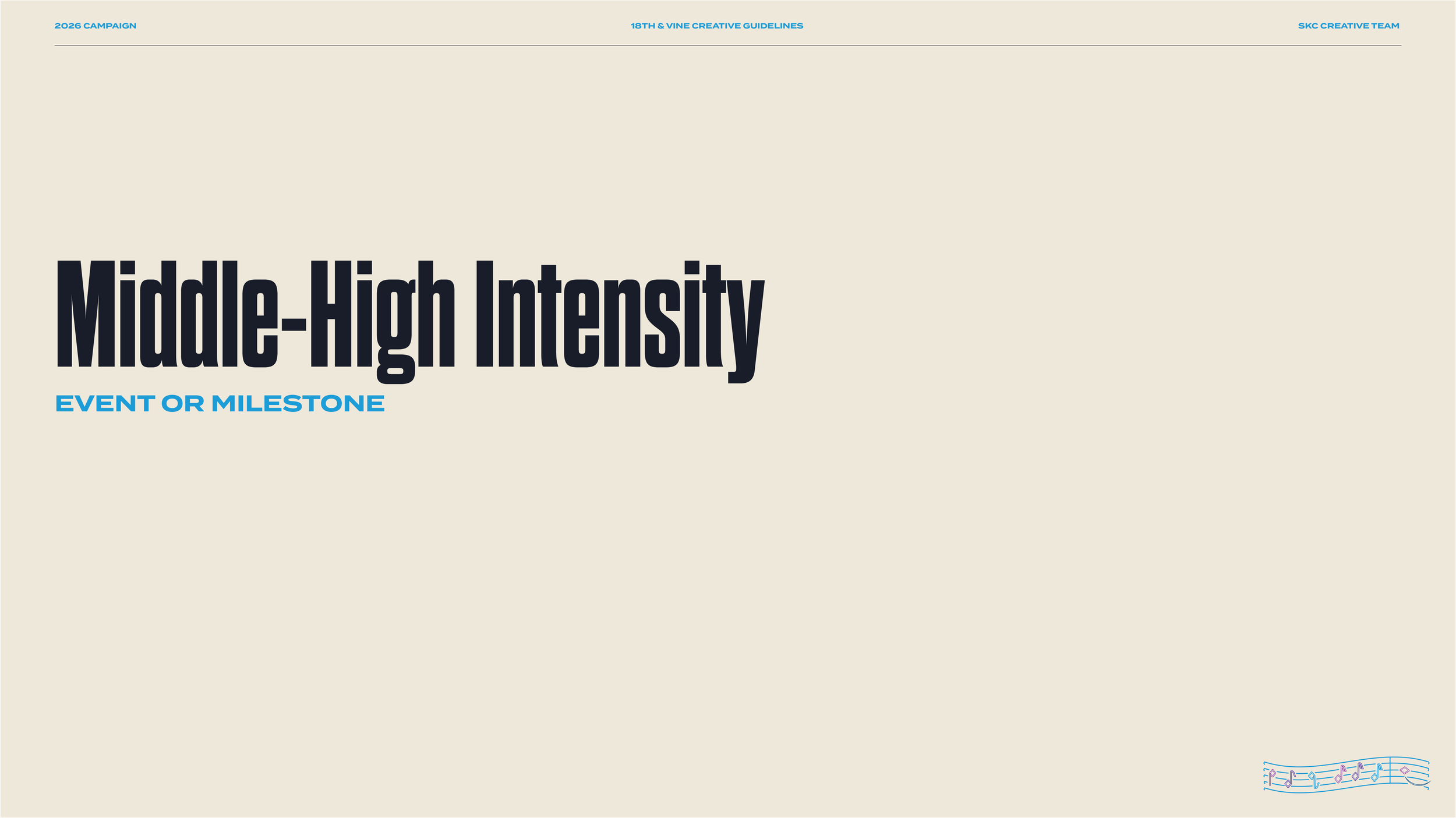
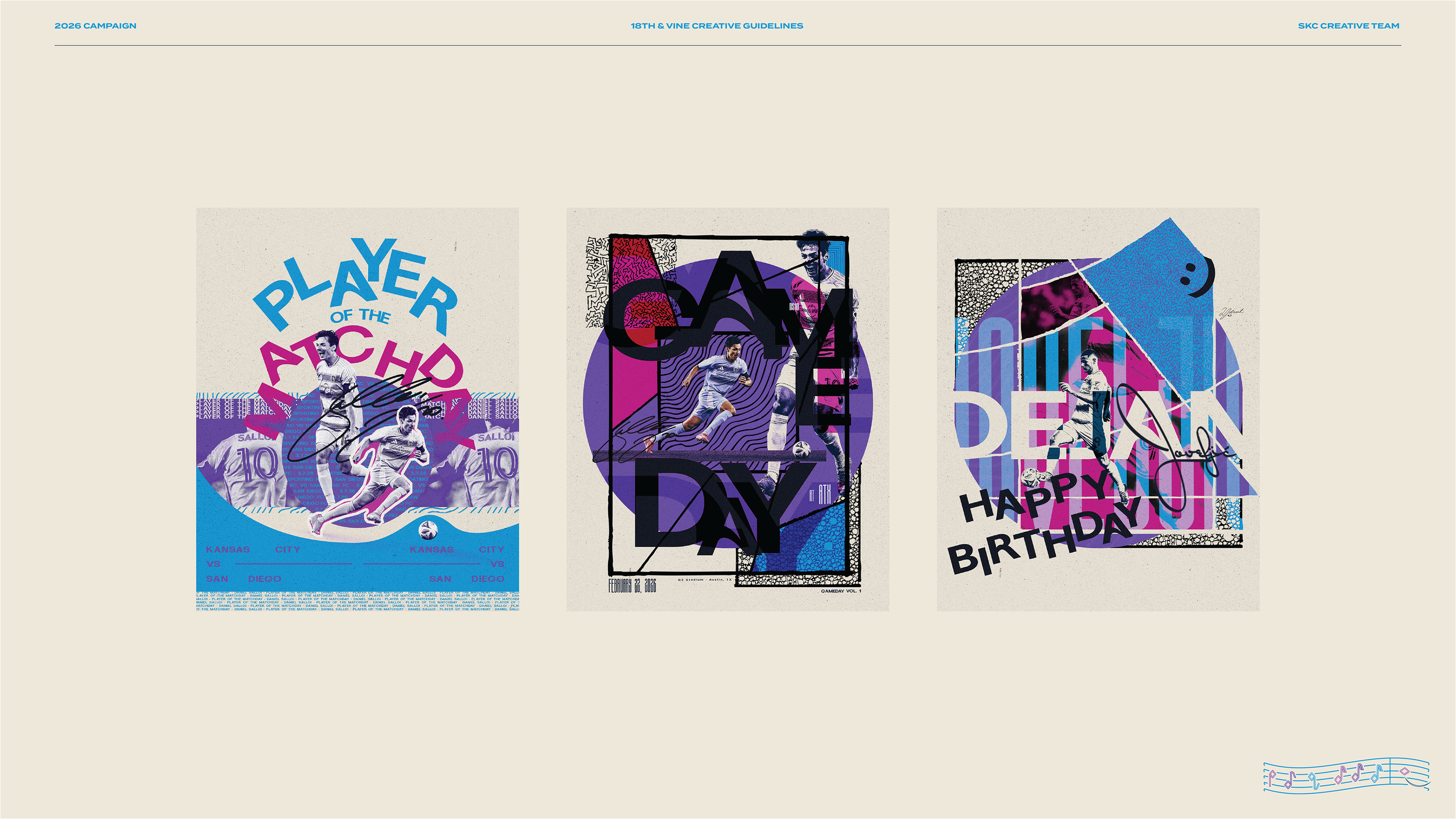
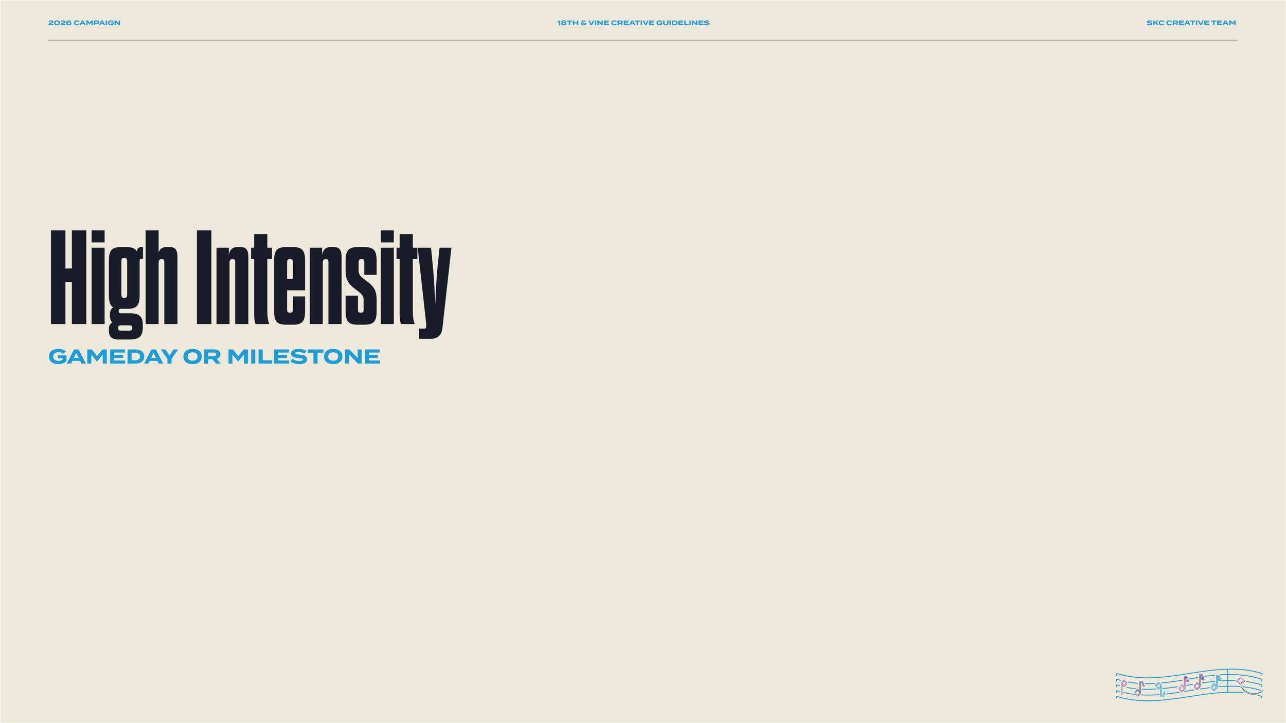
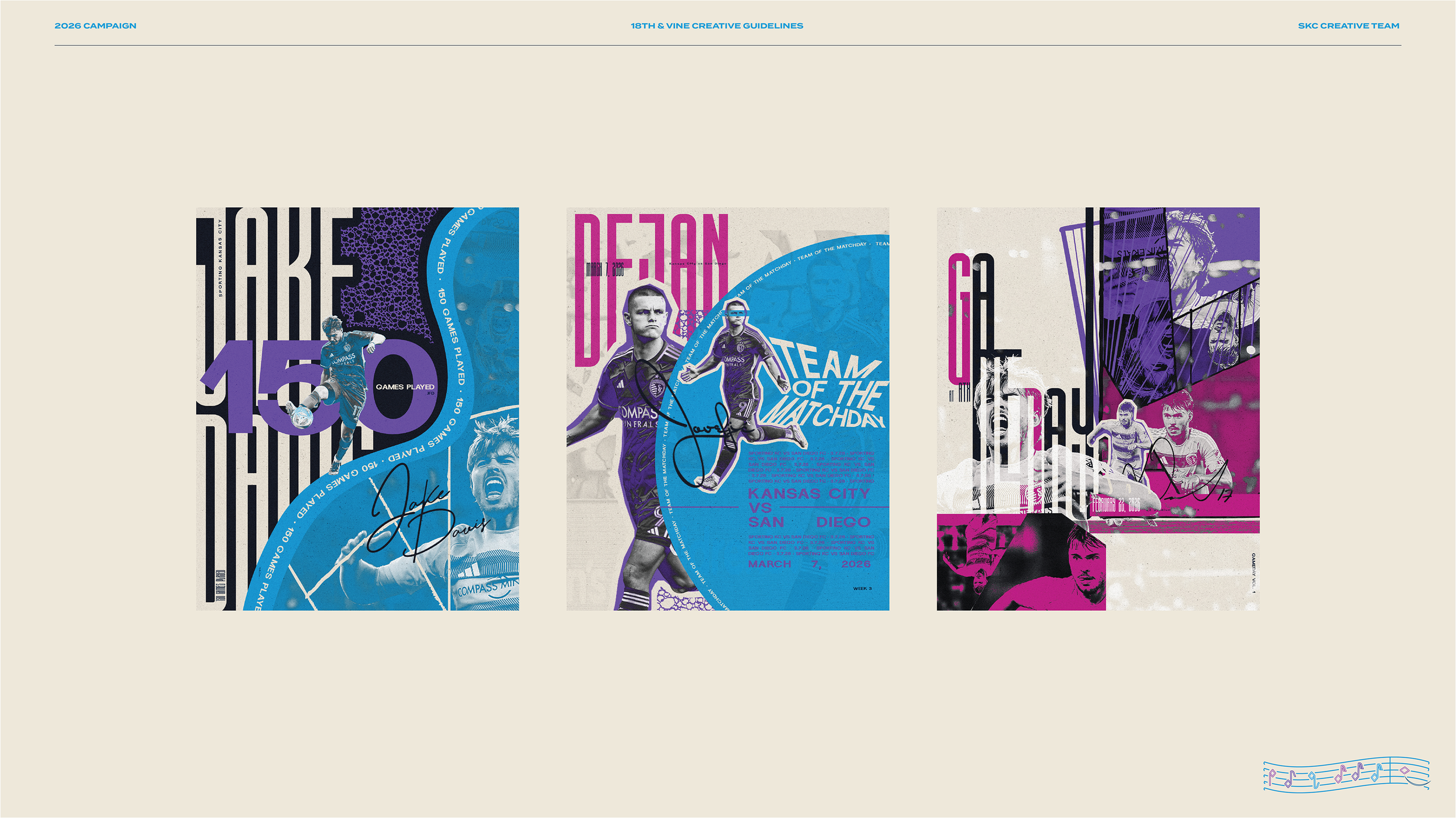
Slider Scale of Intensity
Our tiered design system moves like jazz, aligning visual expression with the emotional rhythm of the season. Low intensity sets a clean, composed baseline - steady, restrained, and professional. Low-middle introduces subtle movement and variation, beginning to build energy while maintaining control. Middle-high amplifies momentum through bolder rhythm and visual complexity, carrying the audience toward peak moments. High intensity marks the crescendo - unrestrained, electrifying, and reserved for moments that demand full attention and elicit powerful fan response.
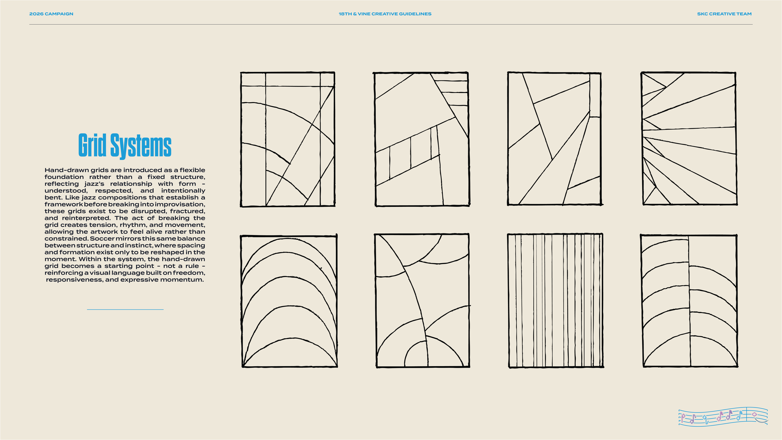
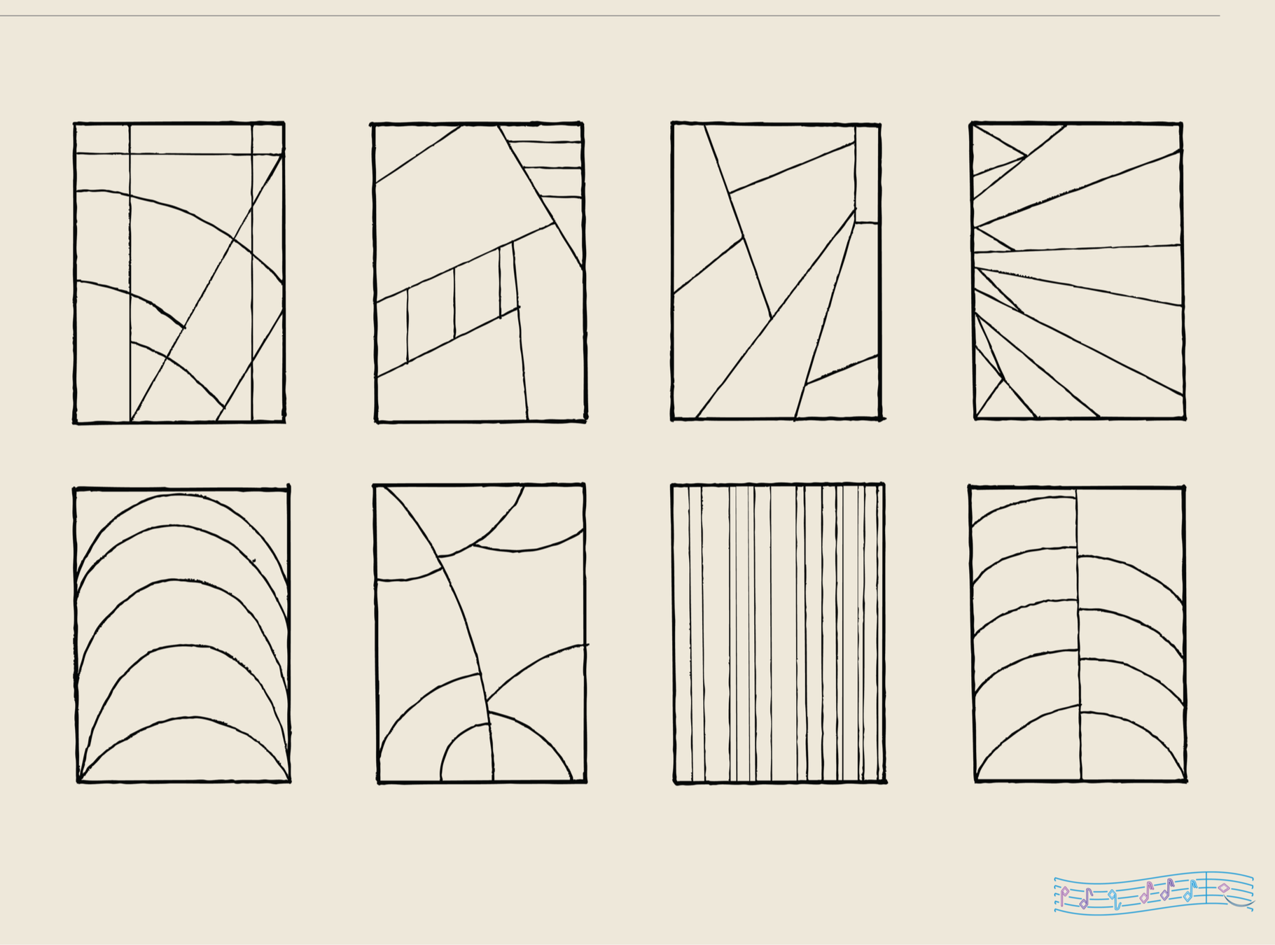
Grid Systems
Structure Meant to Be Broken
Hand-drawn grids are introduced as a flexible foundation rather than a fixed structure, reflecting jazz’s relationship with form - understood, respected, and intentionally bent. Like jazz compositions that establish a framework before breaking into improvisation, these grids exist to be disrupted, fractured, and reinterpreted. The act of breaking the grid creates tension, rhythm, and movement, allowing the artwork to feel alive rather than constrained. Soccer mirrors this same balance between structure and instinct, where spacing and formation exist only to be reshaped in the moment. Within the system, the hand-drawn grid becomes a starting point - not a rule - reinforcing a visual language built on freedom, responsiveness, and expressive momentum.
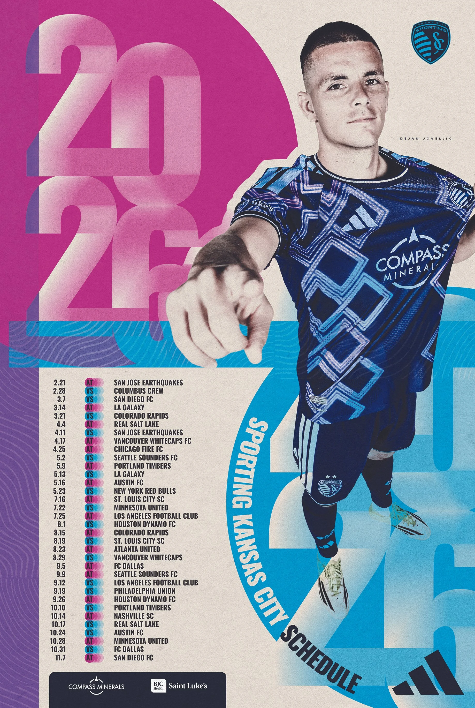
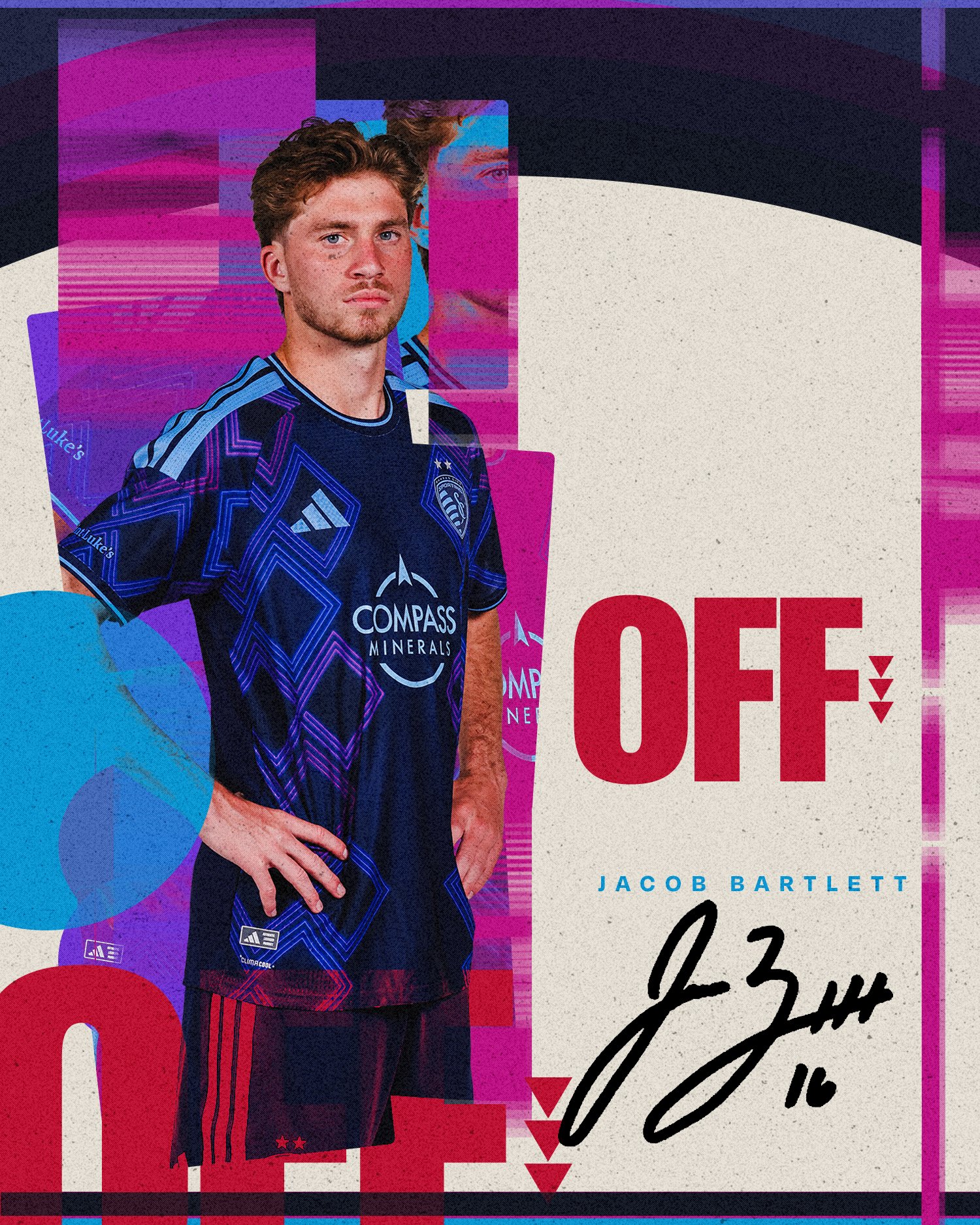
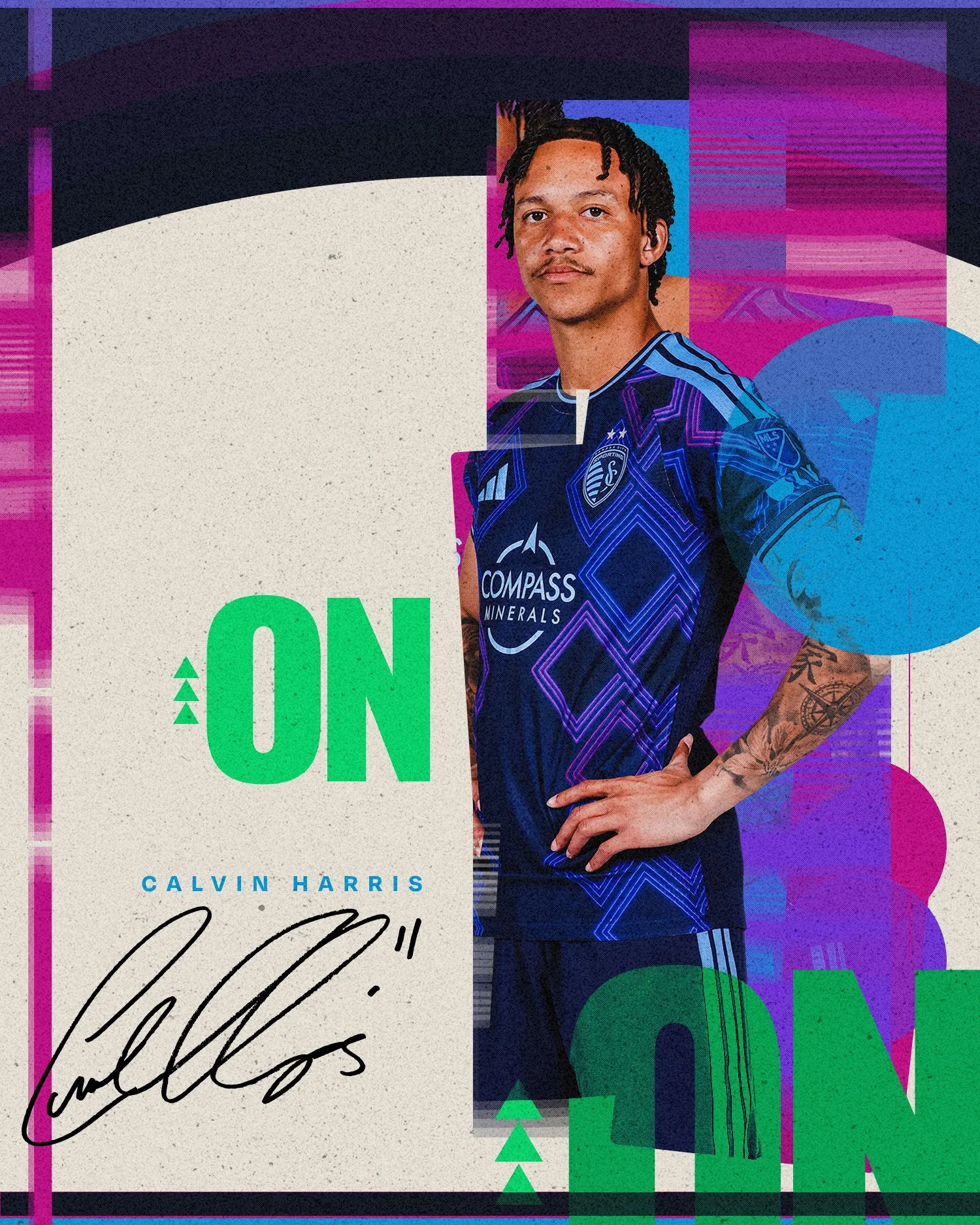
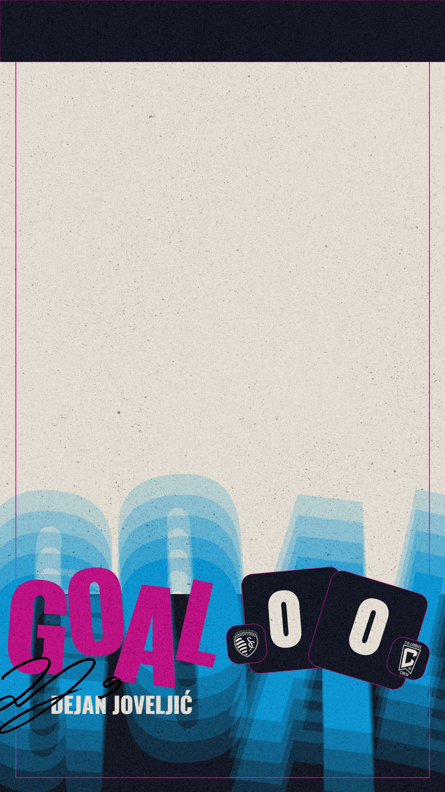
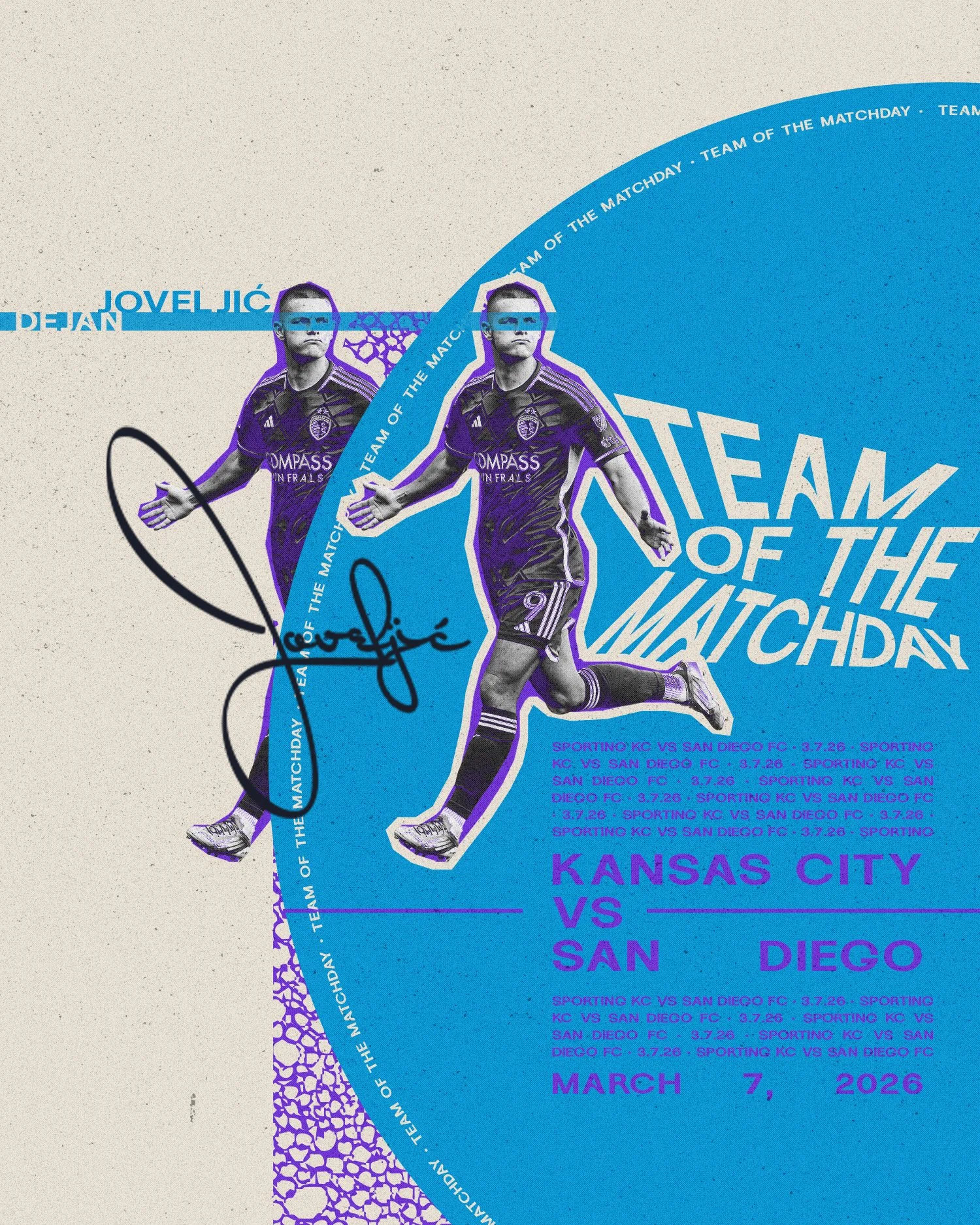
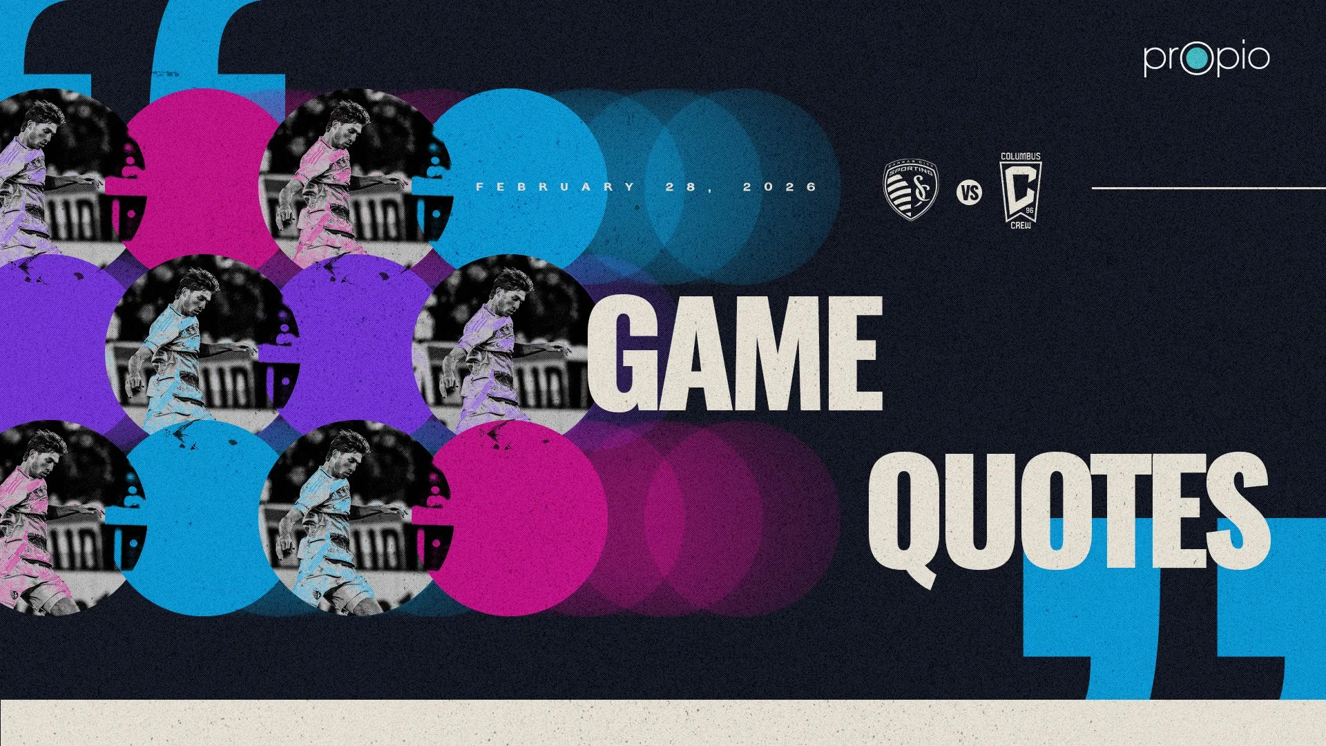
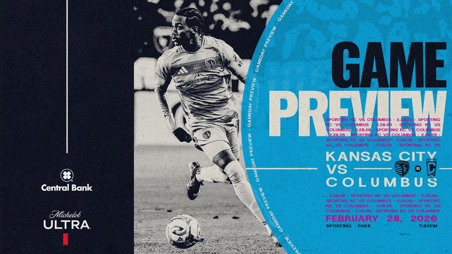
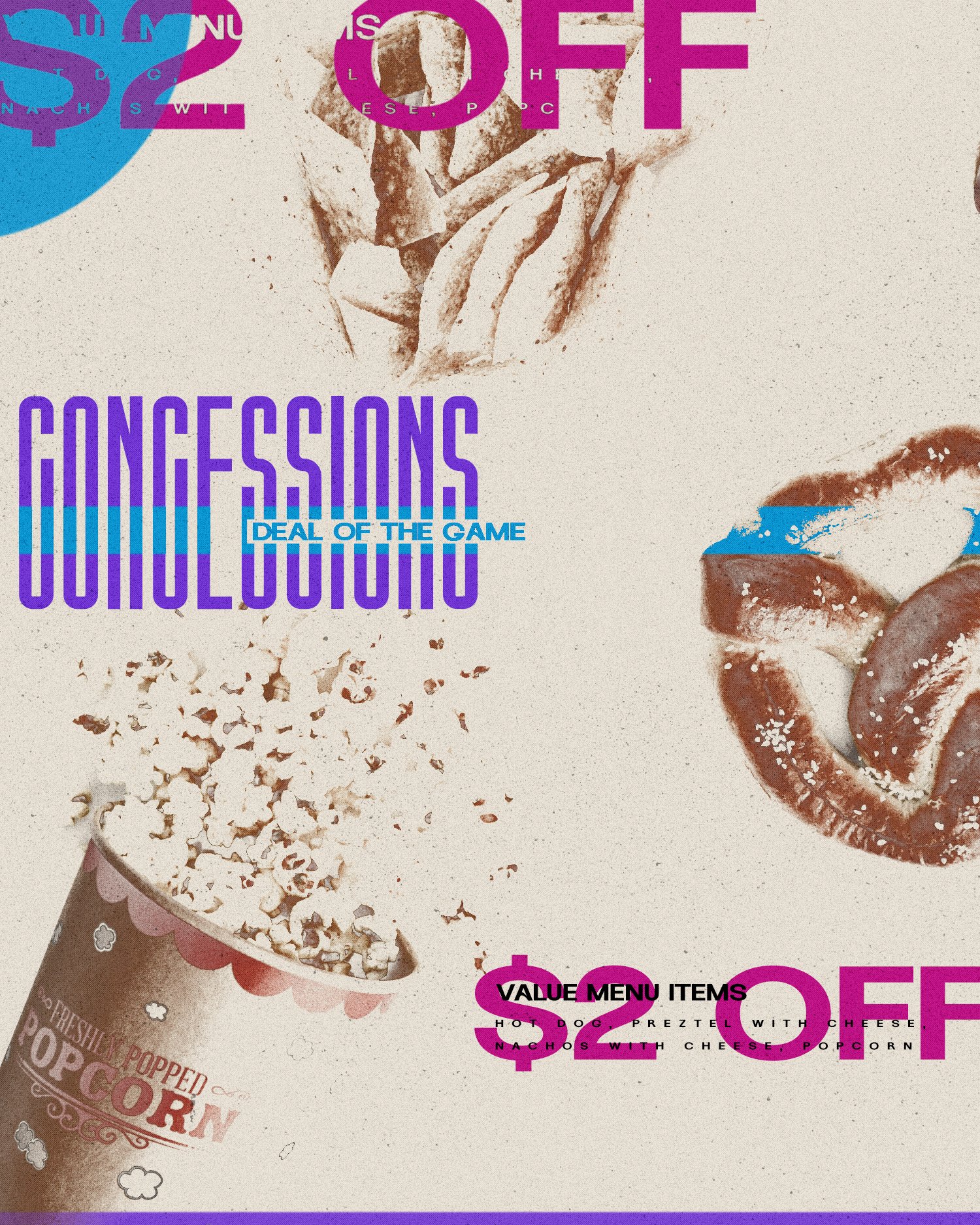
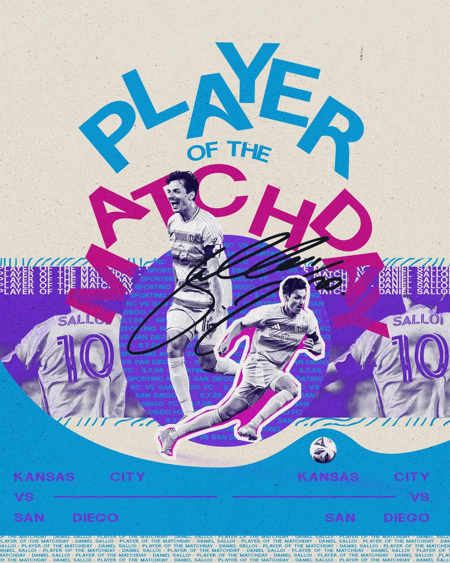
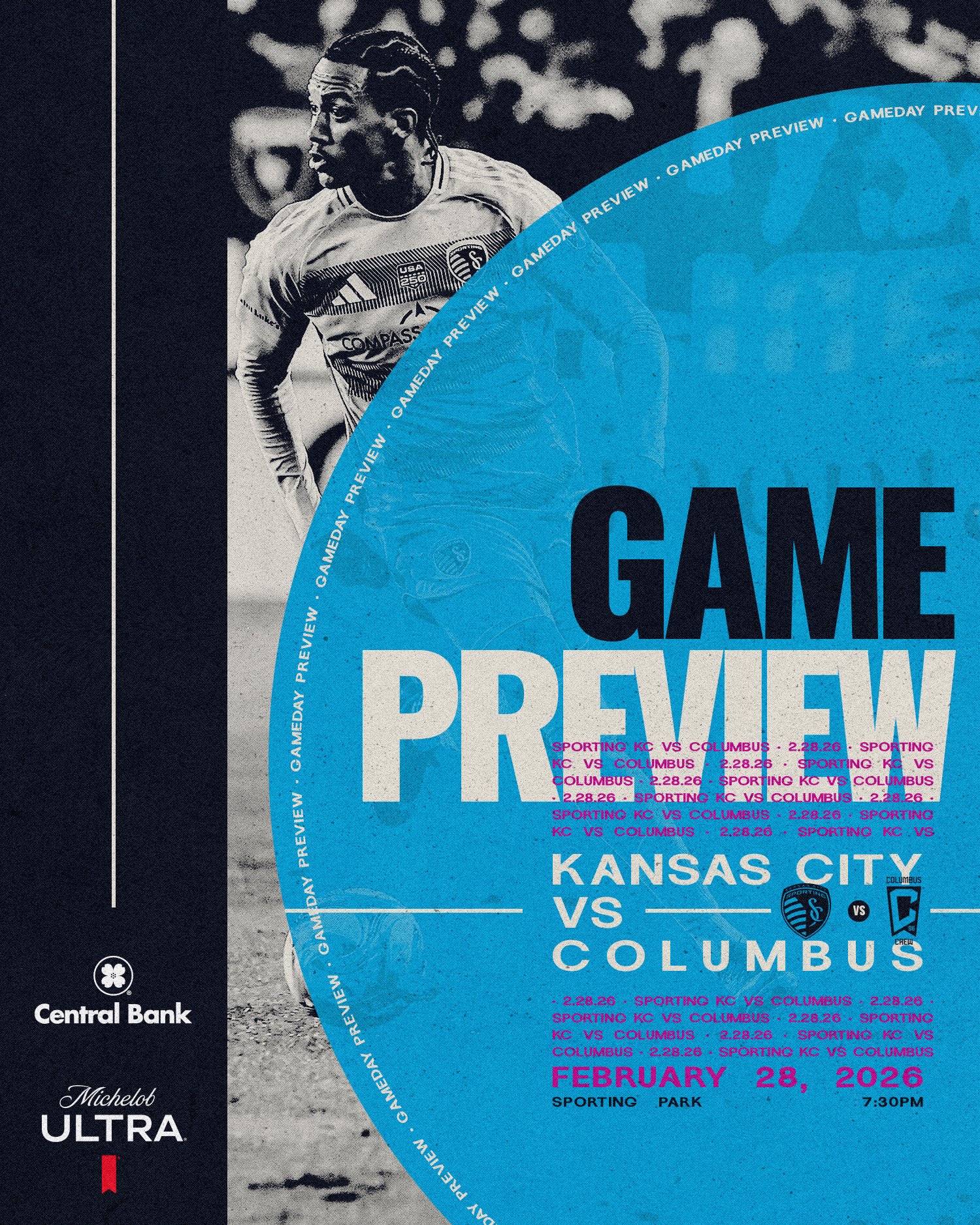
Kit Launch Assets
Seasonal Rollout
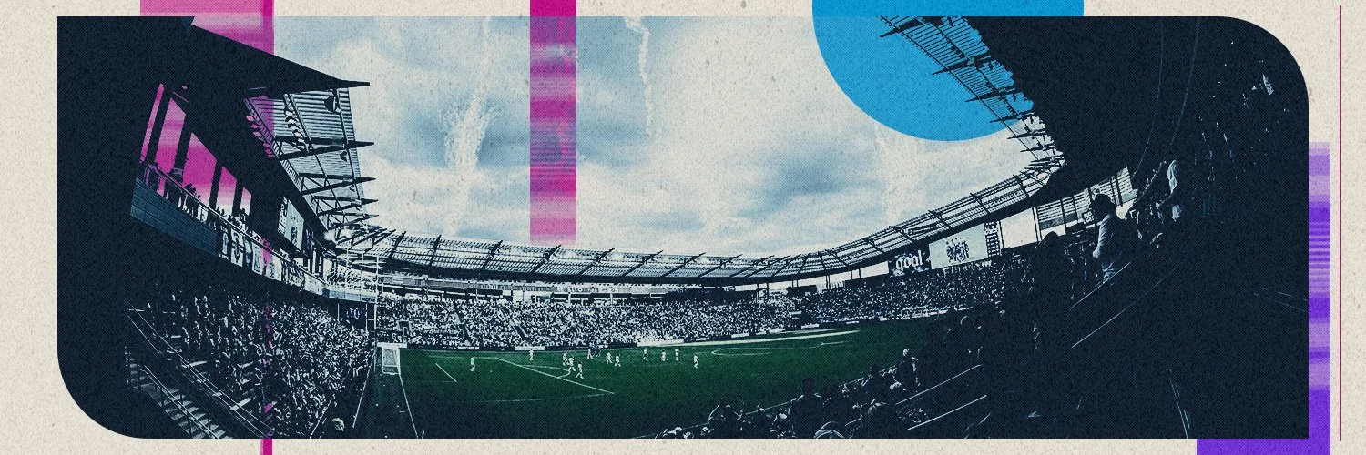
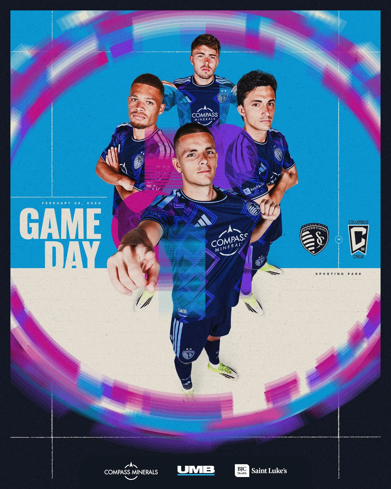
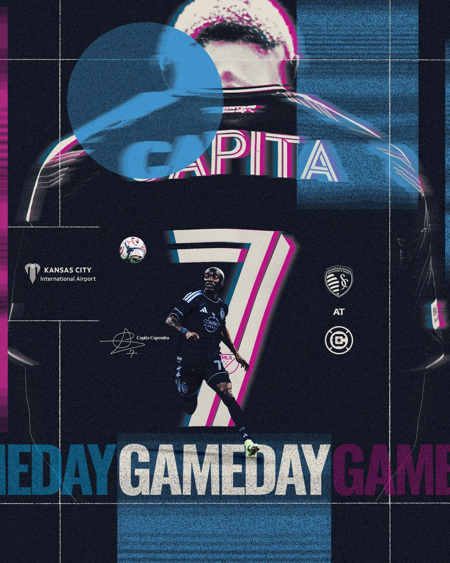
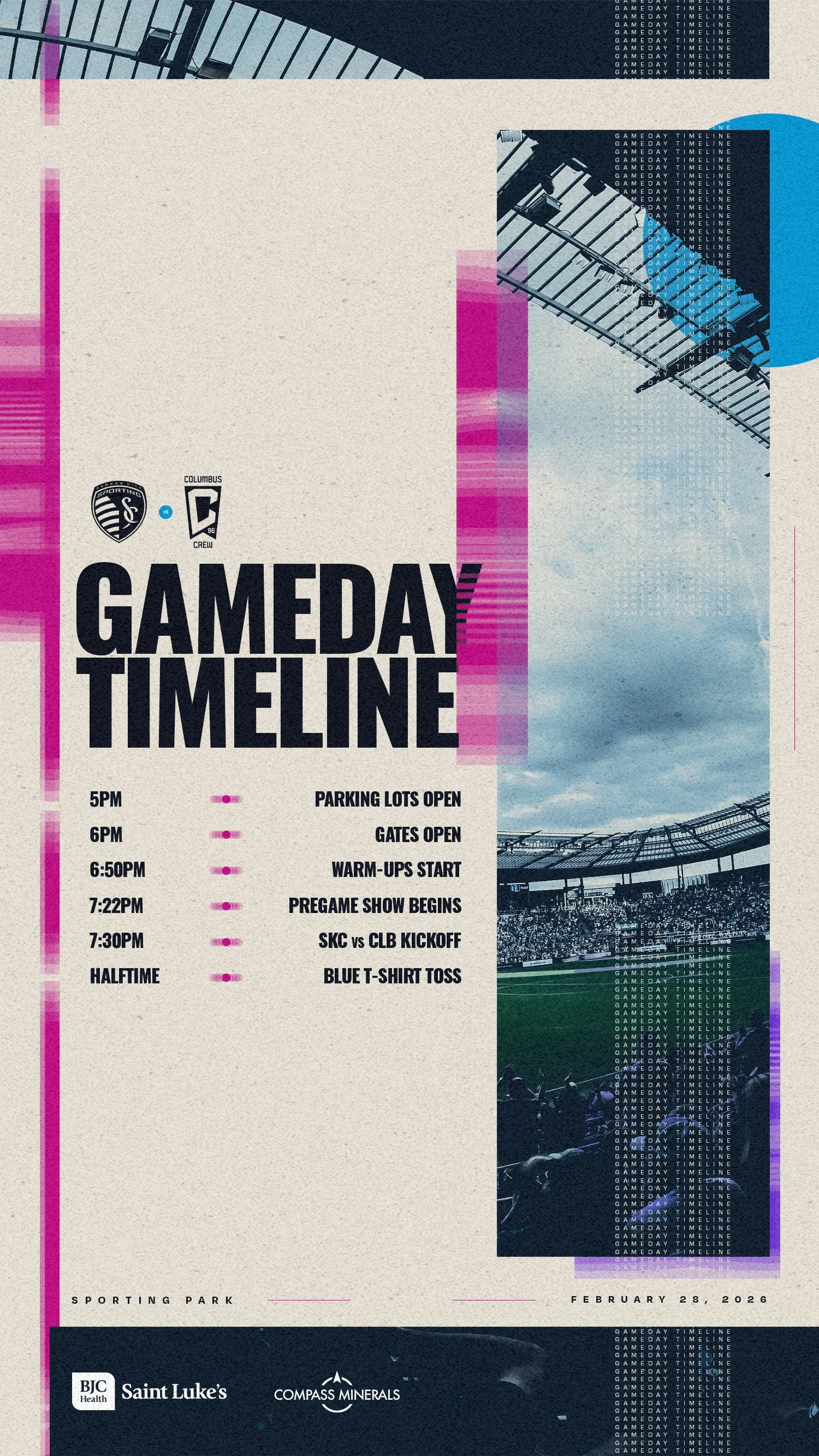
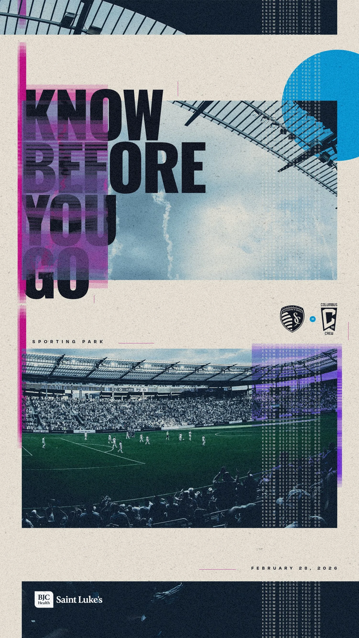
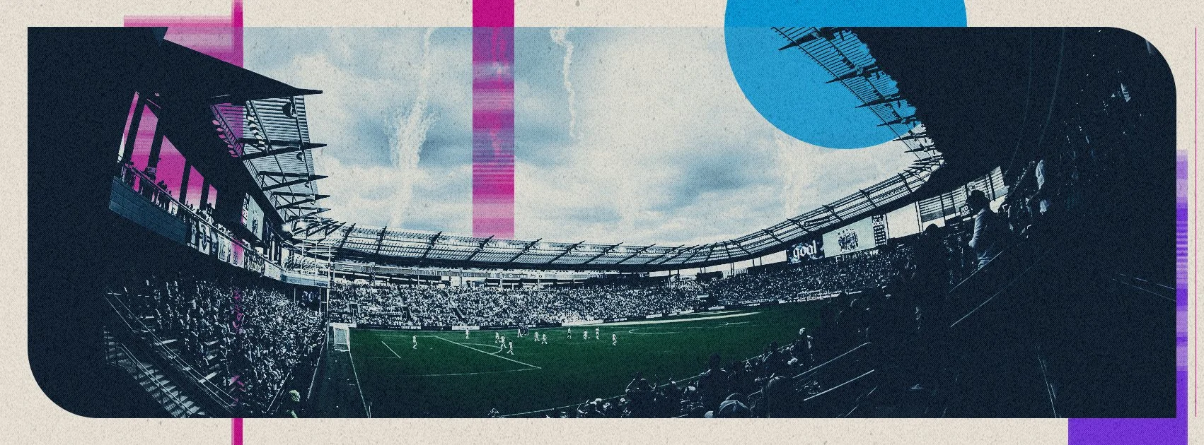
Gameday Graphics & Brand Continuity
One of the most important aspects of the campaign was ensuring it didn’t end at launch. From the beginning, the goal was to build a visual identity strong enough to carry throughout the entire season across every fan touchpoint - from social media graphics to in-stadium presentation on gamedays.
Because so much intention had been placed into establishing the campaign’s tone, atmosphere, typography, textures, and visual systems early in the process, we were able to extend those brand standards naturally into ongoing seasonal content. Every gameday graphic, social asset, scoreboard visual, and promotional piece became an opportunity to reinforce the identity established during launch rather than drifting away from it over time.
That consistency was critical. In sports, campaigns can easily lose cohesion once the day-to-day content cycle begins moving quickly. By building strong creative guidelines from the start, we created a framework that allowed the campaign to evolve throughout the season while still feeling visually connected to the original story and inspiration behind the jersey.
The continuity between launch content and seasonal execution helped strengthen the overall fan experience. Whether supporters encountered the campaign online, inside Sporting Park, or through the city via billboards, the visual identity remained recognizable and intentional. Maintaining that consistency helped the 18th & Vine campaign feel less like a single release and more like a living part of the club’s identity throughout the season.
Creative Content Guidelines
As the campaign evolved, maintaining consistency across all creative outputs became increasingly important. I helped develop creative content guidelines that established a unified visual direction across photography, video, graphics, social assets, and marketing materials.
These guidelines focused on preserving the tone and identity of the campaign regardless of format or platform. Everything from color treatment and typography to composition and pacing was approached intentionally to ensure the project felt cohesive from launch announcement through rollout.
The objective was to create a visual system flexible enough for multiple teams and deliverables while still preserving the emotional atmosphere that made the campaign distinct.