Sporting Kansas City Kids Day
Lead Designer + Art Direction
2026
Kids Day Creative Direction Overview
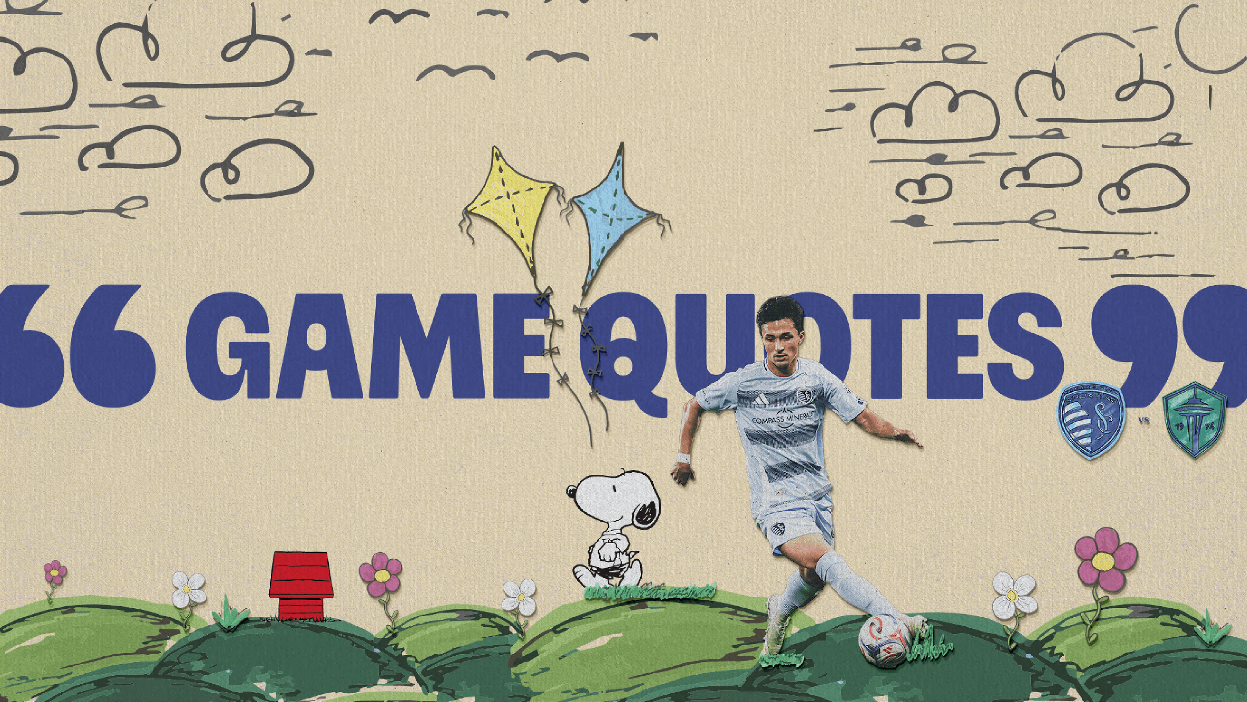
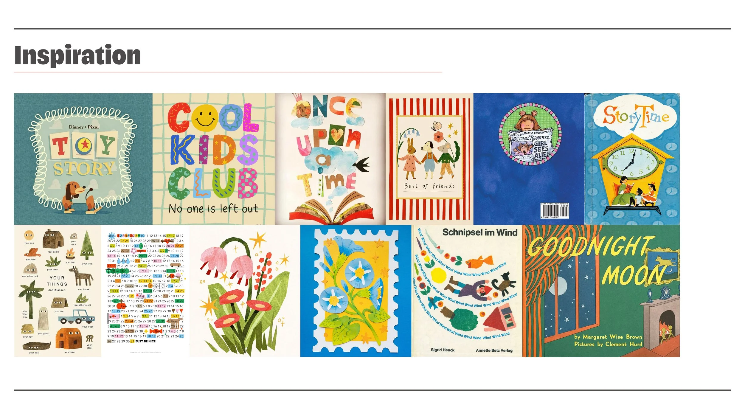
Sporting Kansas City’s Kids Day creative direction is centered on the idea of rediscovering the joy of being a kid. Inspired by the nostalgic look and feel of late 90s and early 2000s children’s books, shows, and classroom creativity, the campaign blends playful, imaginative elements with the structure of professional soccer. A muted, pastel-leaning color palette drawn from classic markers, paired with bold yet rounded typography and a soft, expressive serif, creates a visual identity that feels both grown-up and childlike. Hand-drawn details, cutout photography, and construction paper textures reinforce a “play like a kid again” mindset - positioning soccer as fun, approachable, and rooted in creativity. The result is a warm, nostalgic, and energetic direction that invites fans of all ages to reconnect with play.
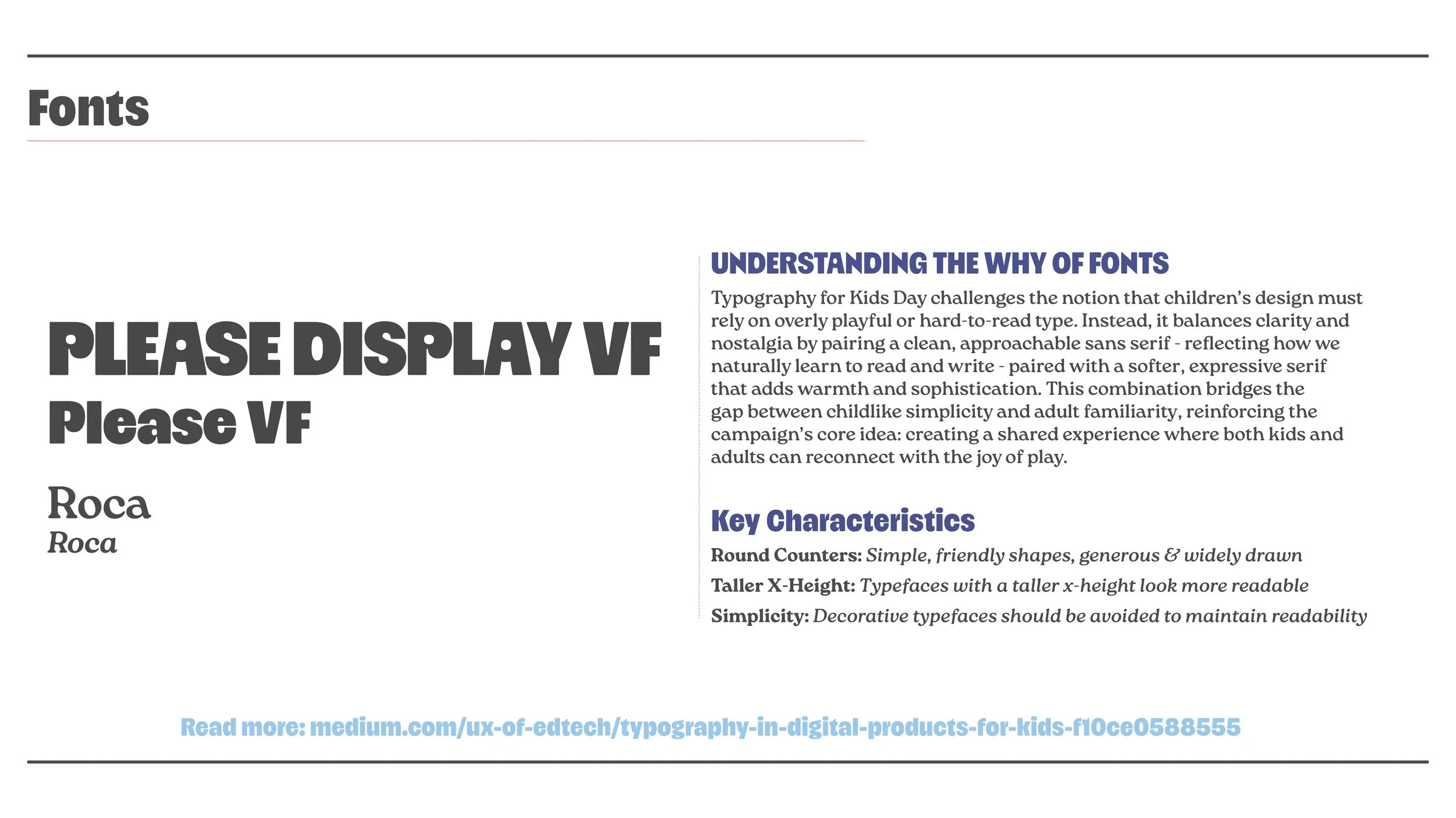
Understanding the Why of Fonts
Typography for Kids Day challenges the notion that children’s design must rely on overly playful or hard-to-read type. Instead, it balances clarity and nostalgia by pairing a clean, approachable sans serif - reflecting how we naturally learn to read and write - paired with a softer, expressive serif that adds warmth and sophistication. This combination bridges the gap between childlike simplicity and adult familiarity, reinforcing the campaign’s core idea: creating a shared experience where both kids and adults can reconnect with the joy of play.
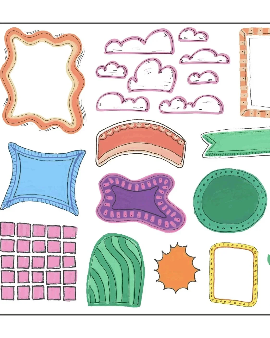
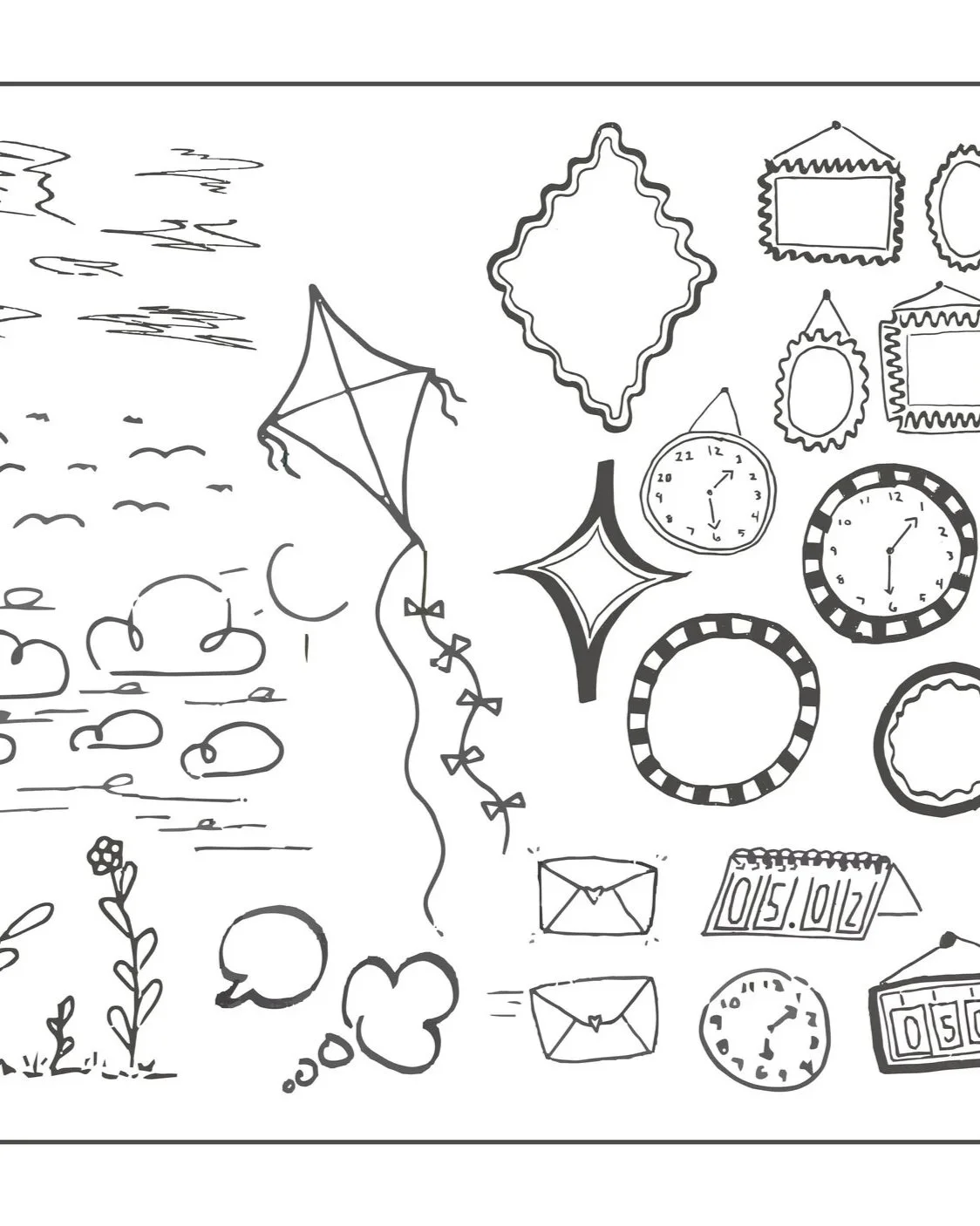
Visual Style
The design aesthetic pulls heavily from nostalgic references: school supplies, hand-drawn illustrations, cut paper, and early 2000s media textures. Elements feel tactile and imperfect - celebrating creativity over precision. Hand-drawn graphics introduce a sense of spontaneity
and personality, mimicking doodles in notebooks or margins of schoolwork. Cutout
photography layered with construction paper textures adds depth and reinforces the DIY,
arts-and-crafts feel. Playful compositions break rigid grids, allowing elements to overlap, tilt,
and interact dynamically - capturing the energy of childhood creativity. This visual system bridges the gap between playful expression and the polished world of professional soccer.
Drawn by Hand, Designed with Purpose
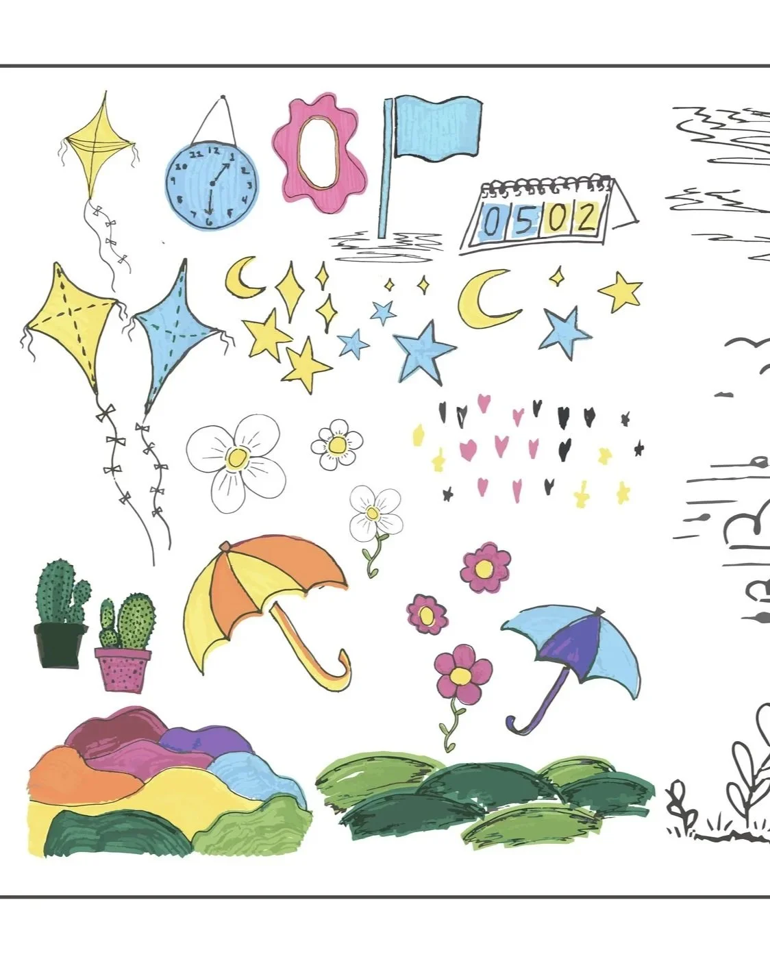

Color Palette
The palette is intentionally simple and rooted in nostalgia. Inspired
by a classic box of markers, colors are familiar and approachable but softened to feel timeless. The color saturation is slightly reduced to
create a muted, pastel-leaning palette. The result is a collection of
tones that feel warm, comforting, and reminiscent of childhood without appearing overly bright or juvenile. Colors are used thoughtfully to
maintain balance and avoid overwhelming the composition.
Practical Application
Learn how to communicate with clarity, confidence, and purpose. This course explores active listening, tone, body language, and message delivery for stronger, more impactful connections.
Digital Application
Learn how to communicate with clarity, confidence, and purpose. This course explores active listening, tone, body language, and message delivery for stronger, more impactful connections.